
Städtisches Klinikum Braunschweig gGmbH
cyclos design GmbH
Art Direction · Brand & Digital Experience
Red Dot Award
iF Design Award
Annual Multimedia Award

Städtisches Klinikum Braunschweig (skbs) is one of Germany's largest hospitals with more than 4,000 employees and 22 specialist clinics.
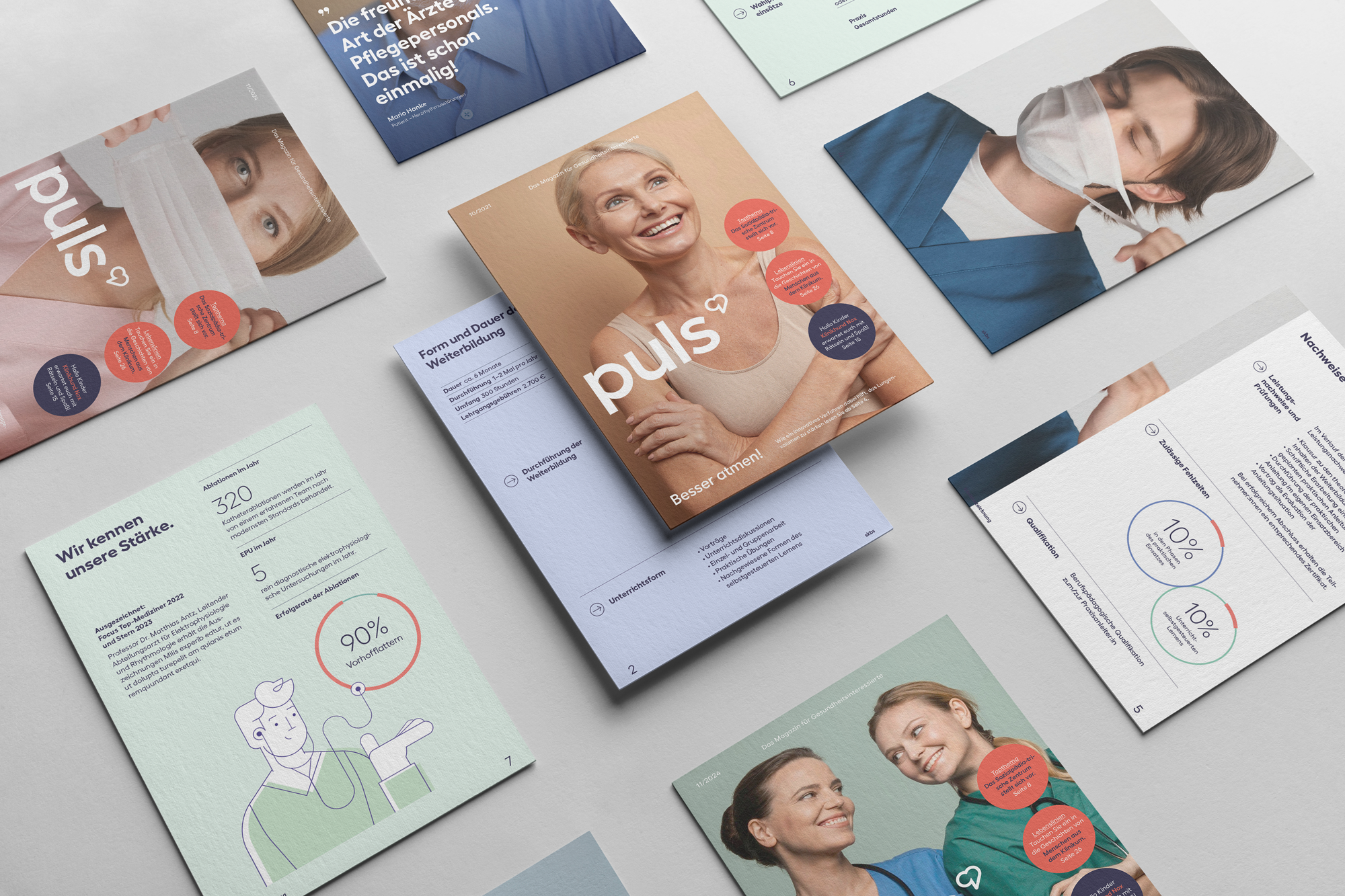
But healthcare is changing, and medical excellence alone is no longer enough. The new brand identity positions Städtisches Klinikum Braunschweig around its greatest strength: combining clinical precision with genuine human care.
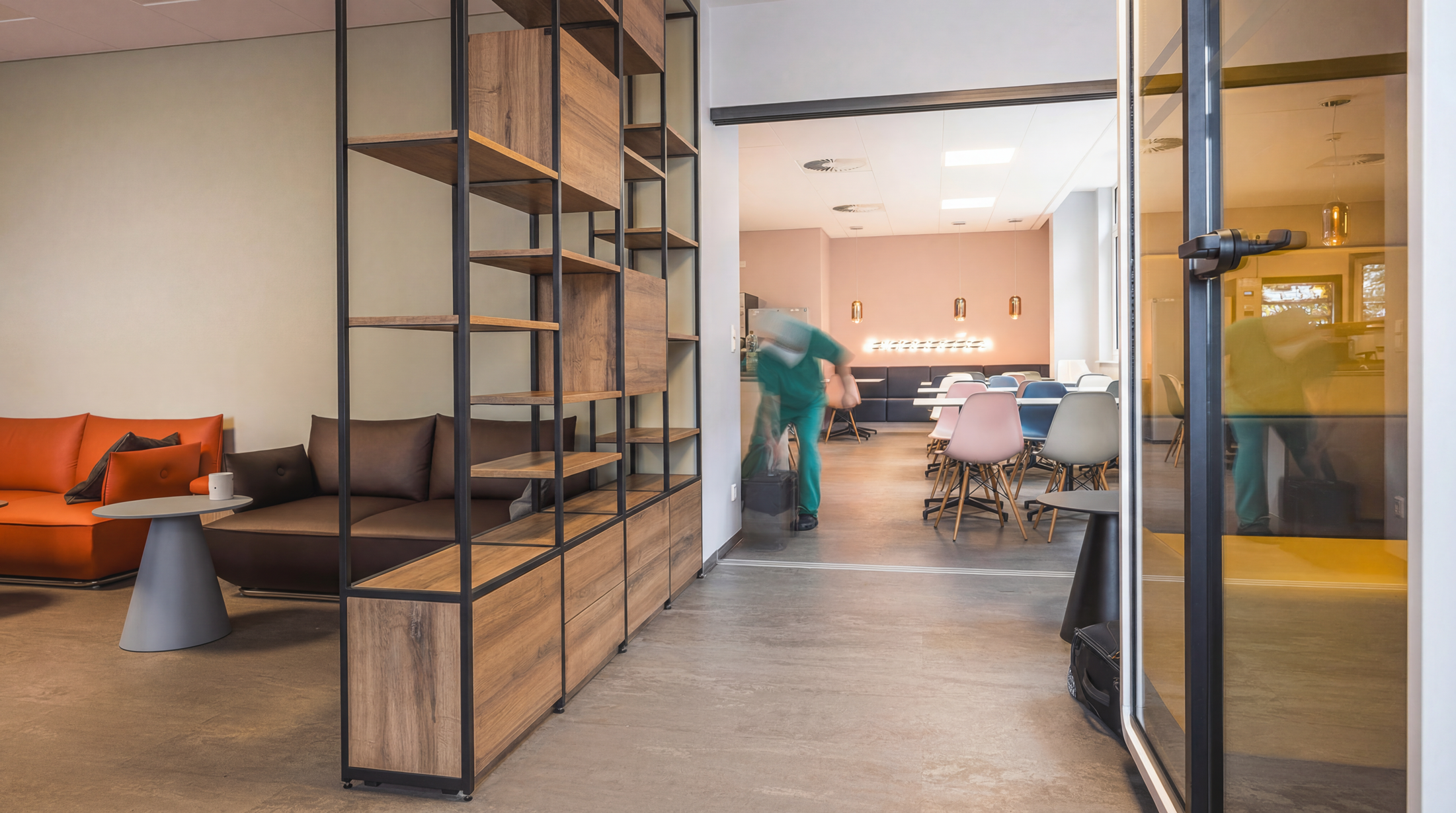
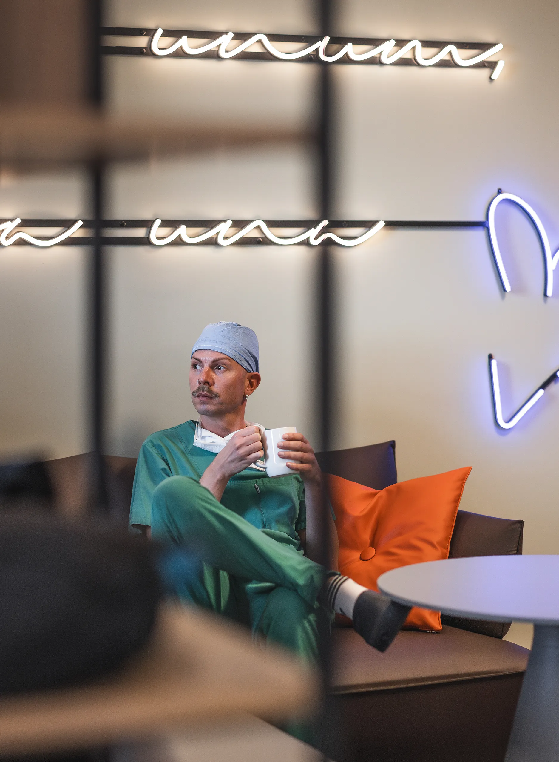
Out task: create a brand system that will strengthen recruitment, improve orientation across a complex hospital environment, and communicate trust across digital, print and physical environments—for patients, visitors and staff.
Because skbs works with multiple internal teams and external agencies, the visual identity had to function as a easy scalable design system as well— one that could be applied consistently across every touchpoint while maintaining a strong and recognisable brand.
The scale of the project demanded a strong team that thinks in systems. As part of a bigger team I:
- Developed the visual identity system
- Created scalable layouts for print, digital and spatial applications
- Defined the colour, illustration, icons and wayfinding systems
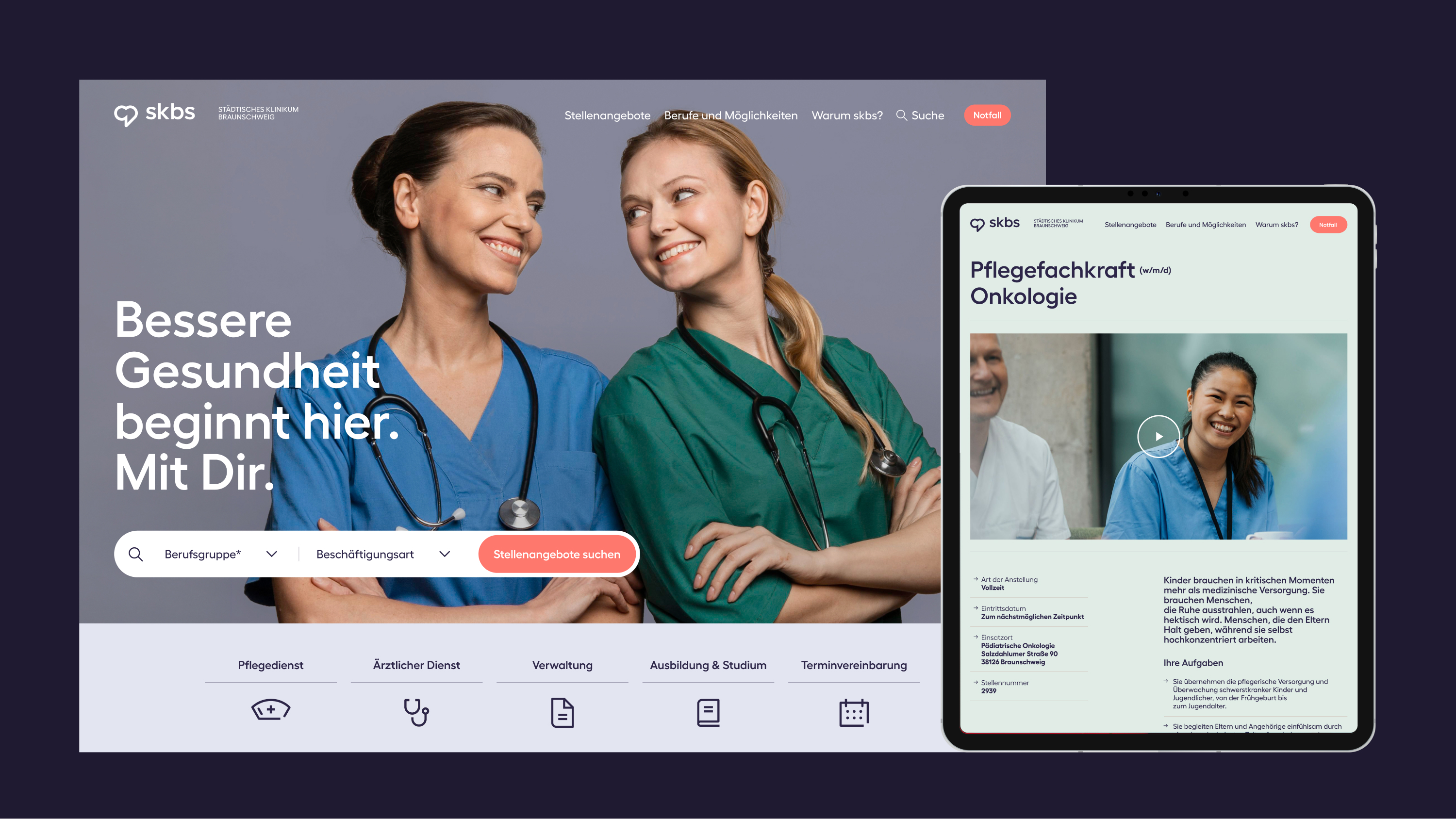
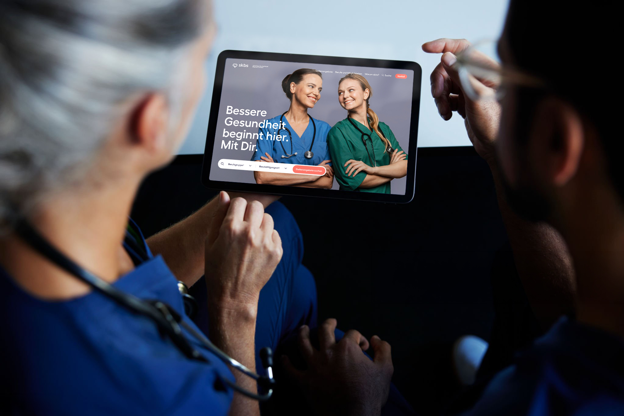
- Designed the UX/UI assets for the career platform
The rebrand began with a comprehensive brand strategy process that defined "Sense of Belonging" as the hospital's employer purpose. This idea became the foundation for the new positioning and the brand promise: "Better health starts here." The strategy shifted the focus beyond clinical excellence, placing equal importance on the human relationships between patients, staff and the wider Braunschweig community.
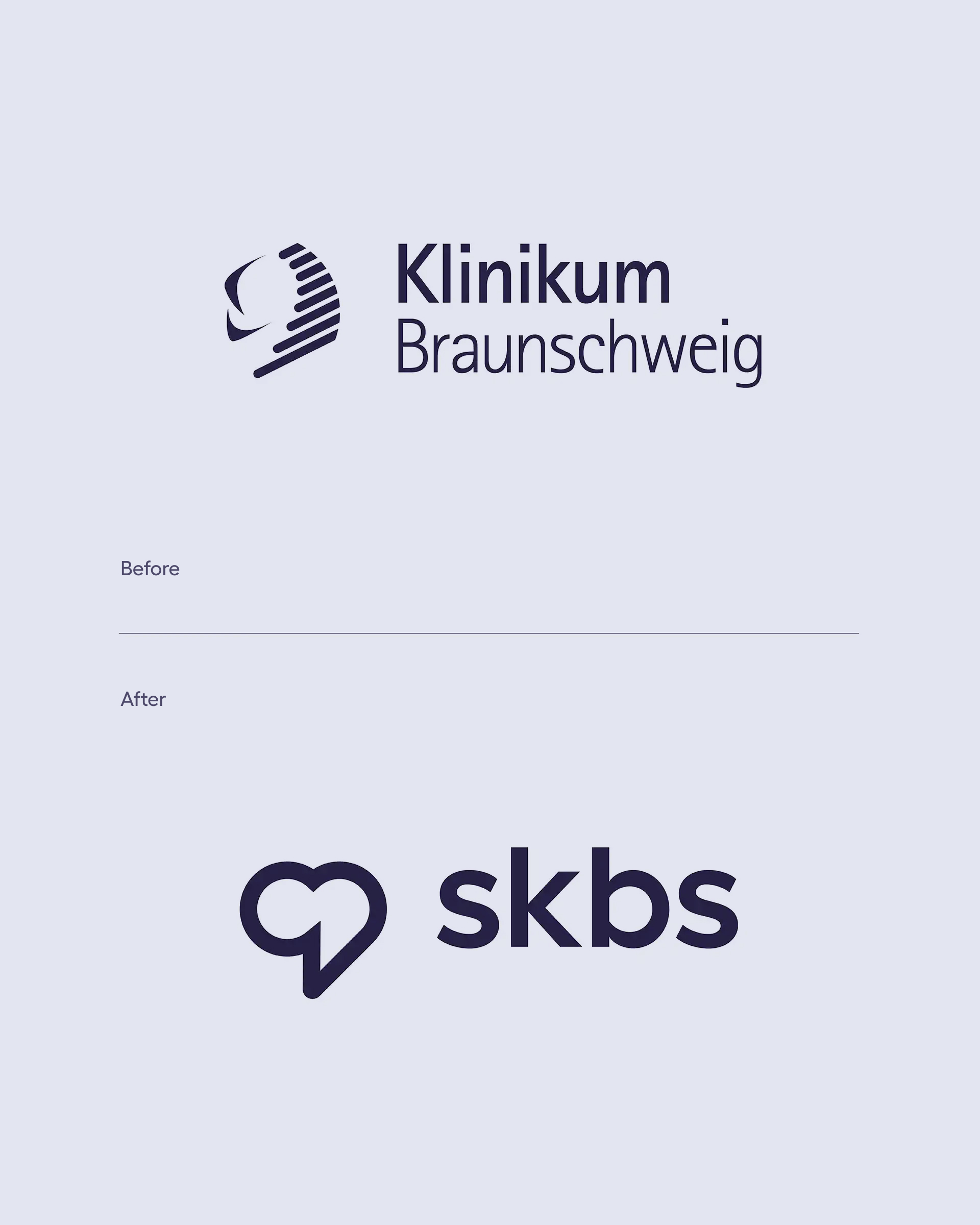
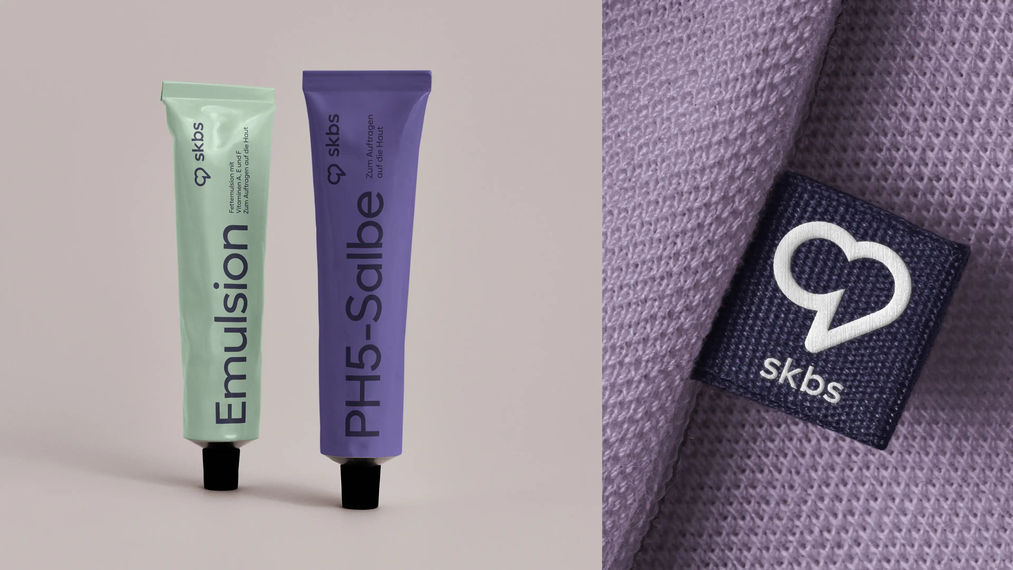
The new logo reflects this strategic shift. The previous symbol, based on Braunschweig's iconic lion, evolved into a heart—transforming a regional emblem into a symbol of care, compassion and healthcare. It represents the balance between medical expertise and human connection at the core of the new brand.
During the identity phase, two logo concepts were developed, including one of my own. The client selected "the heart", which was my colleague's proposal.
After the final logo was selected, my contribution focused on developing part of the visual system that brought the chosen logo to life across every touchpoint. This was a large-scale project carried out by a multidisciplinary team; what follows is my individual contribution to it.
Logotype: Thorsten Schechowiz
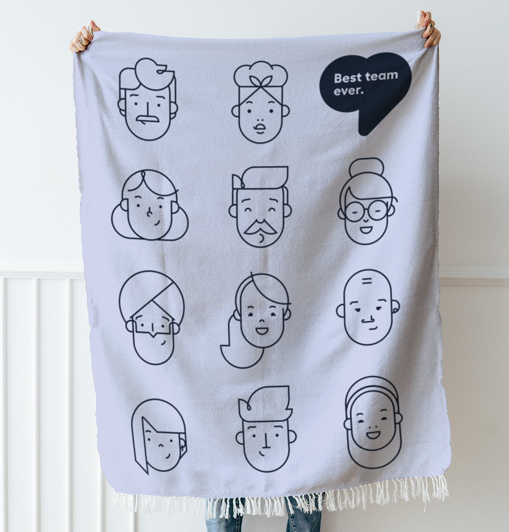
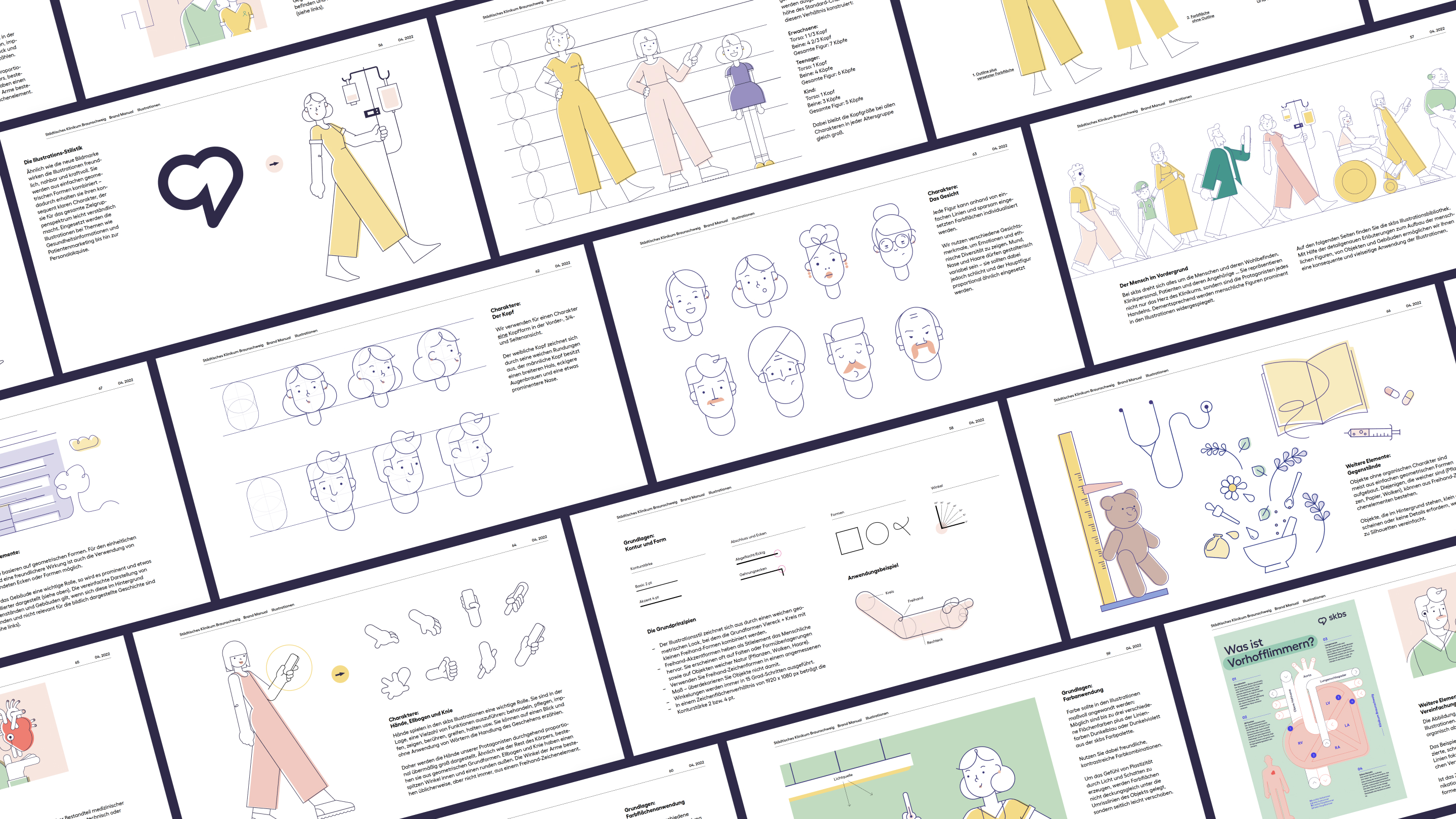
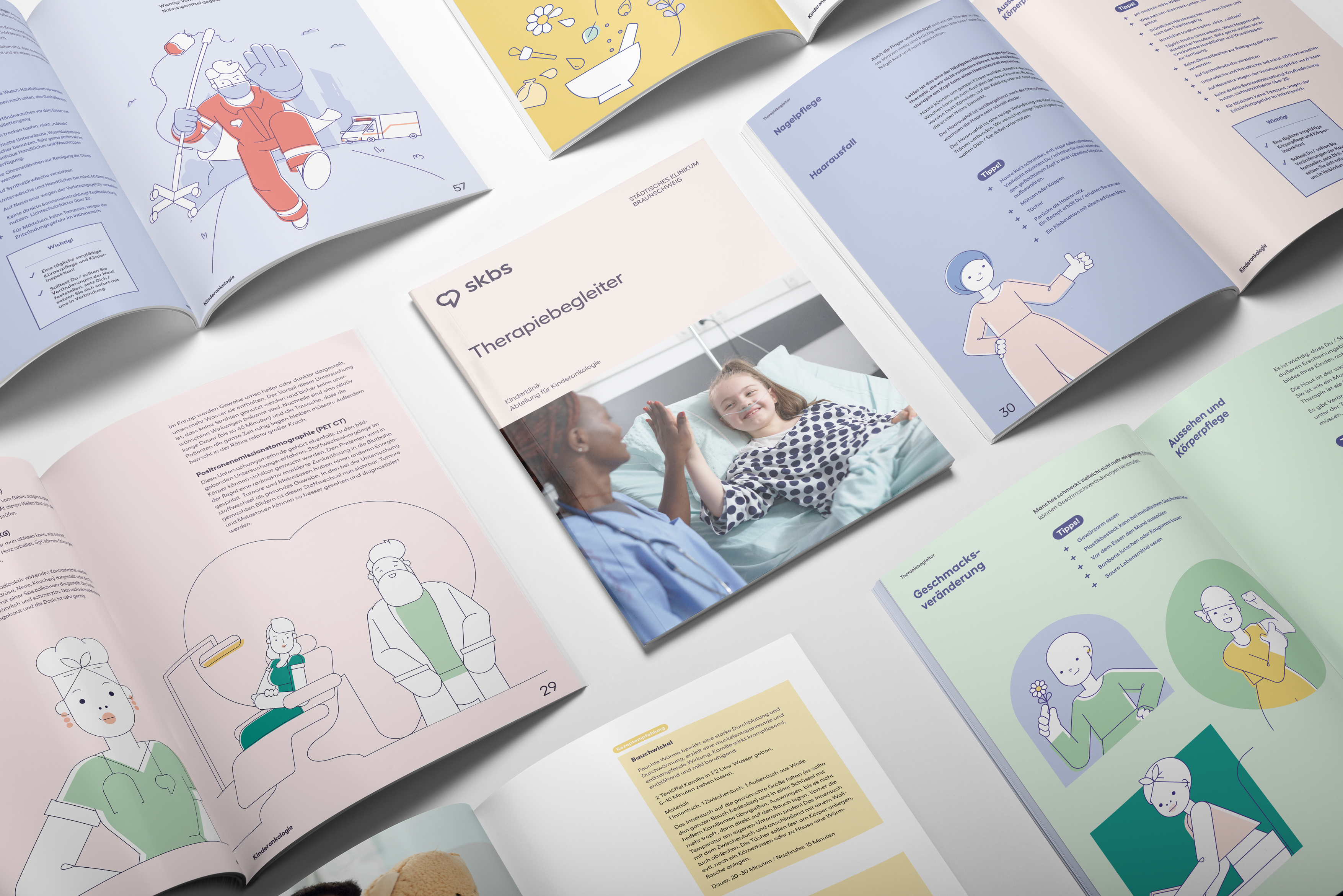
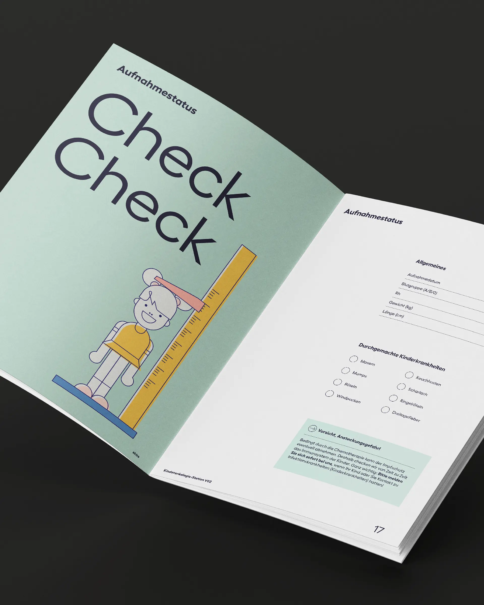
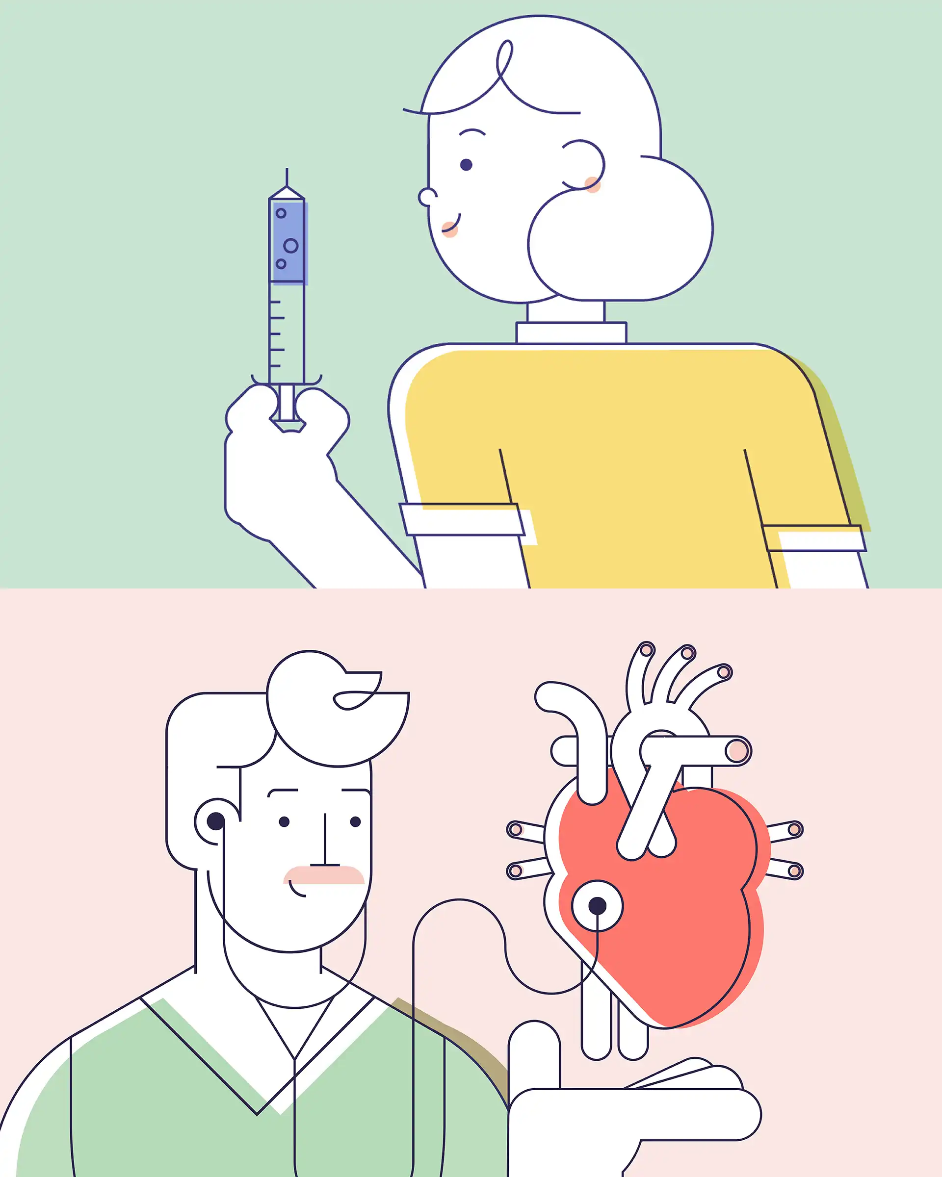
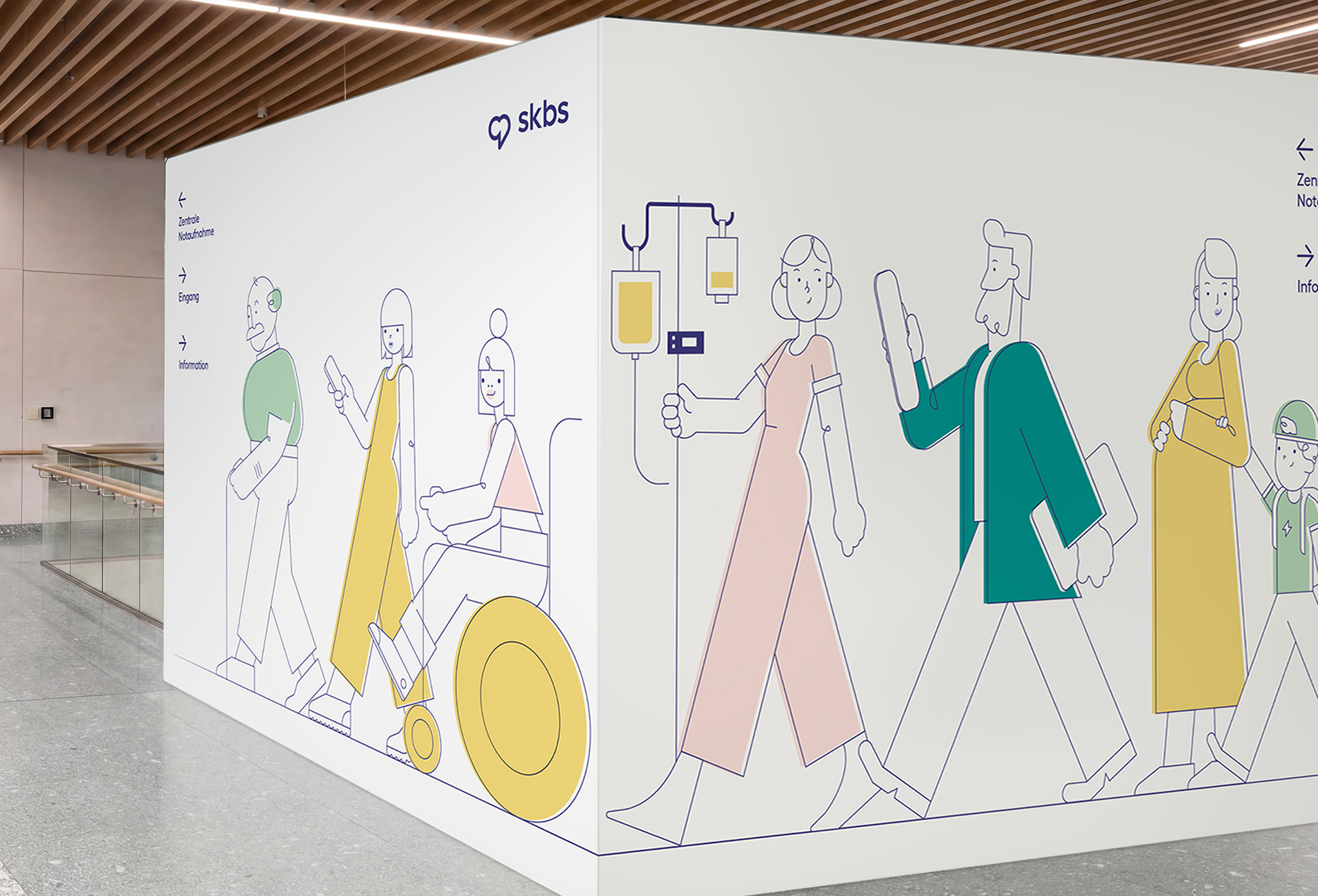
As people from many cultural backgrounds work across skbs, the illustration system was designed to reflect this diverse workforce. A broad range of facial features, hairstyles, ages and individual characteristics creates an inclusive visual world in which more employees can recognize themselves.
This diversity became part of a broader challenge: creating illustrations that make medical content feel approachable, overcome language barriers and build emotional connection—while representing everyone in the clinical environment.
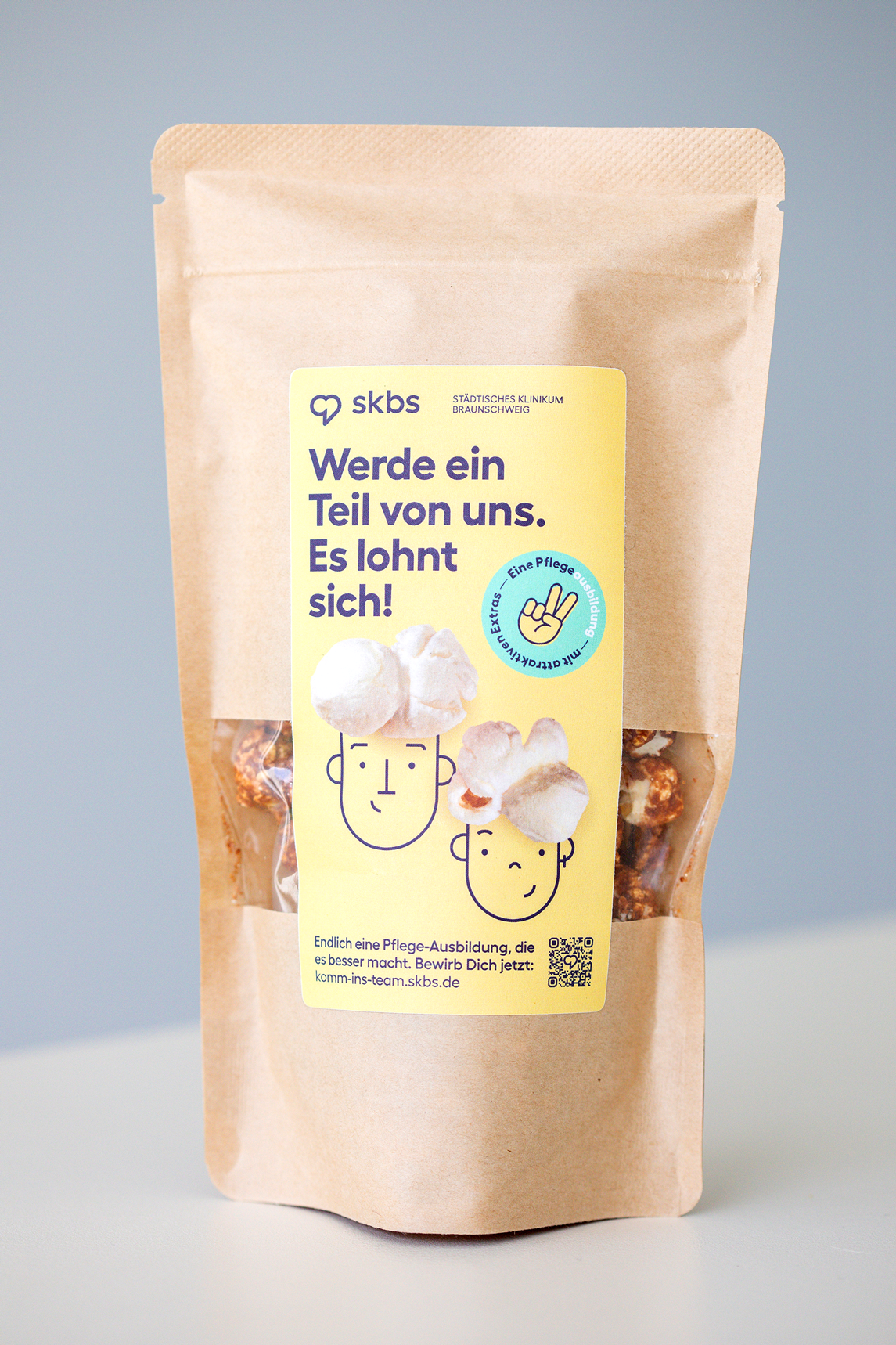
To ensure consistency across multiple agencies, the system was built from a library of predefined, interchangeable elements. These could be easily combined to create new characters and scenes while maintaining one recognizable style—regardless of who produced the illustration. Designed to work in both full colour and two colours, the system also meets the practical production needs of everyday hospital communication.
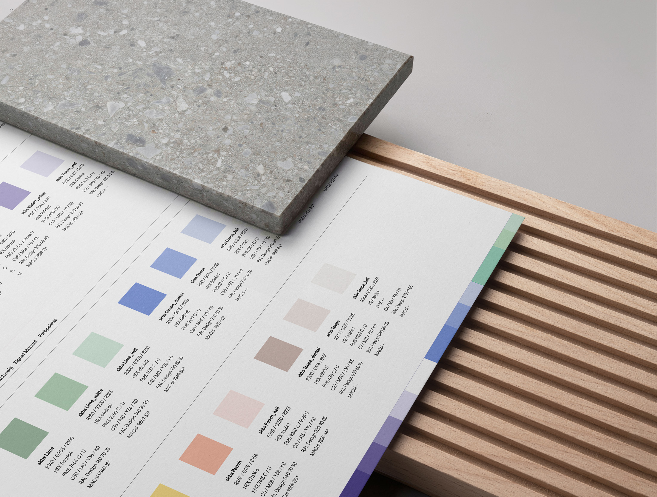
Choosing colors for a Hospital as big as skbs was a big responsibility and not an easy task.
The palette had to work not only for the brand logic in print and digital, but also for the interior and what actually works for a body that is healing.
My research shaped the color approach entirely.
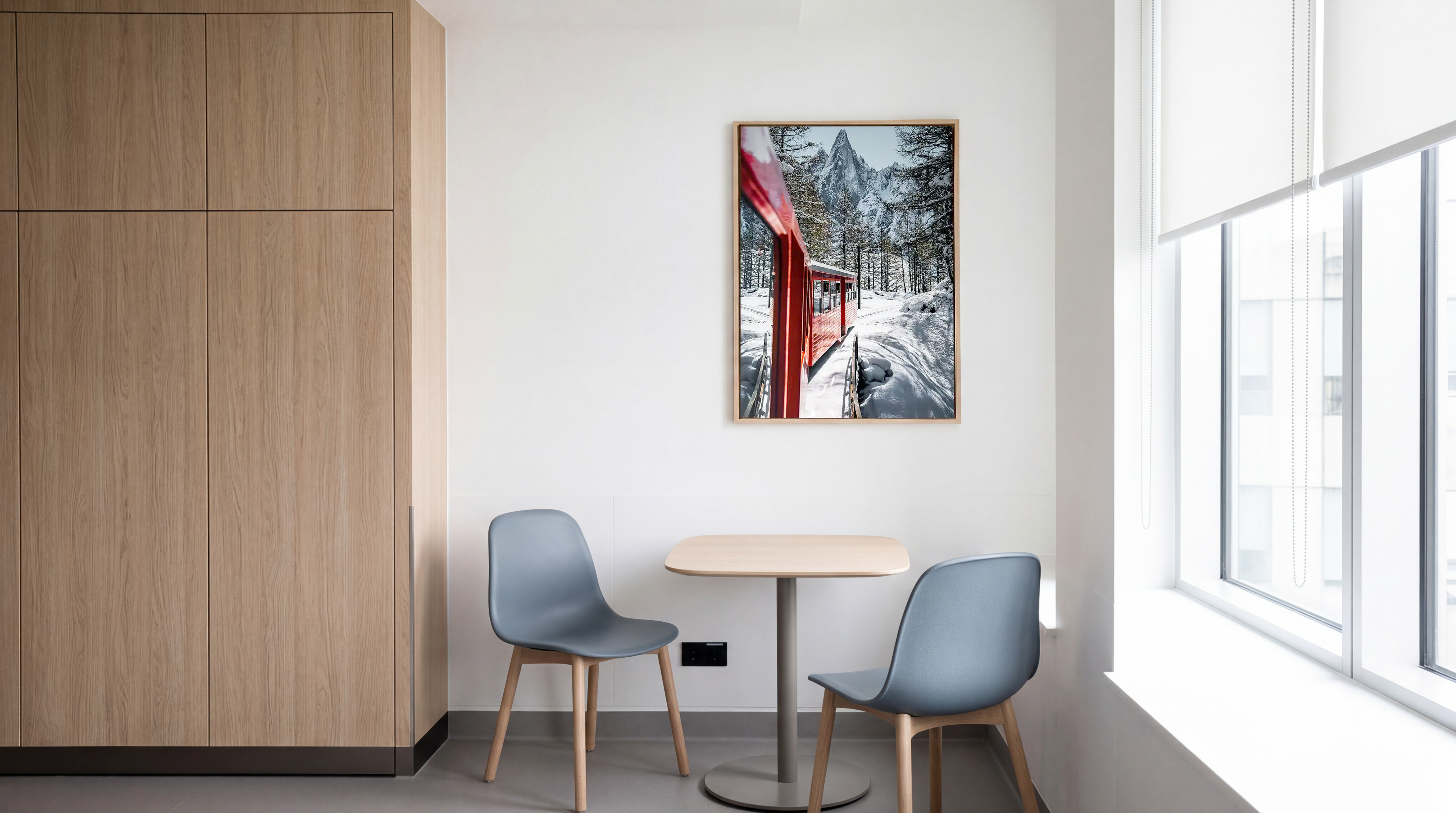
The principle here is biophilic design: the evidence-based approach integrates visual connections to nature into built spaces to reduce stress and pain, lower cortisol levels, and support faster recovery.
How did this translate into the skbs environment?
Working closely with the interior architects, we provided feedback on how the brand principles could translate consistently into the physical environment.
Light pastels and warm wood tones for comfort
Soft, desaturated colours reduce visual noise and create a sense of calm without feeling clinical or sterile.
Natural materials and references to the outdoors Large-scale nature imagery, warm earthy neutrals and textures reminiscent of bark and stone create a familiar, reassuring atmosphere that can help reduce the stress often associated with clinical environments.
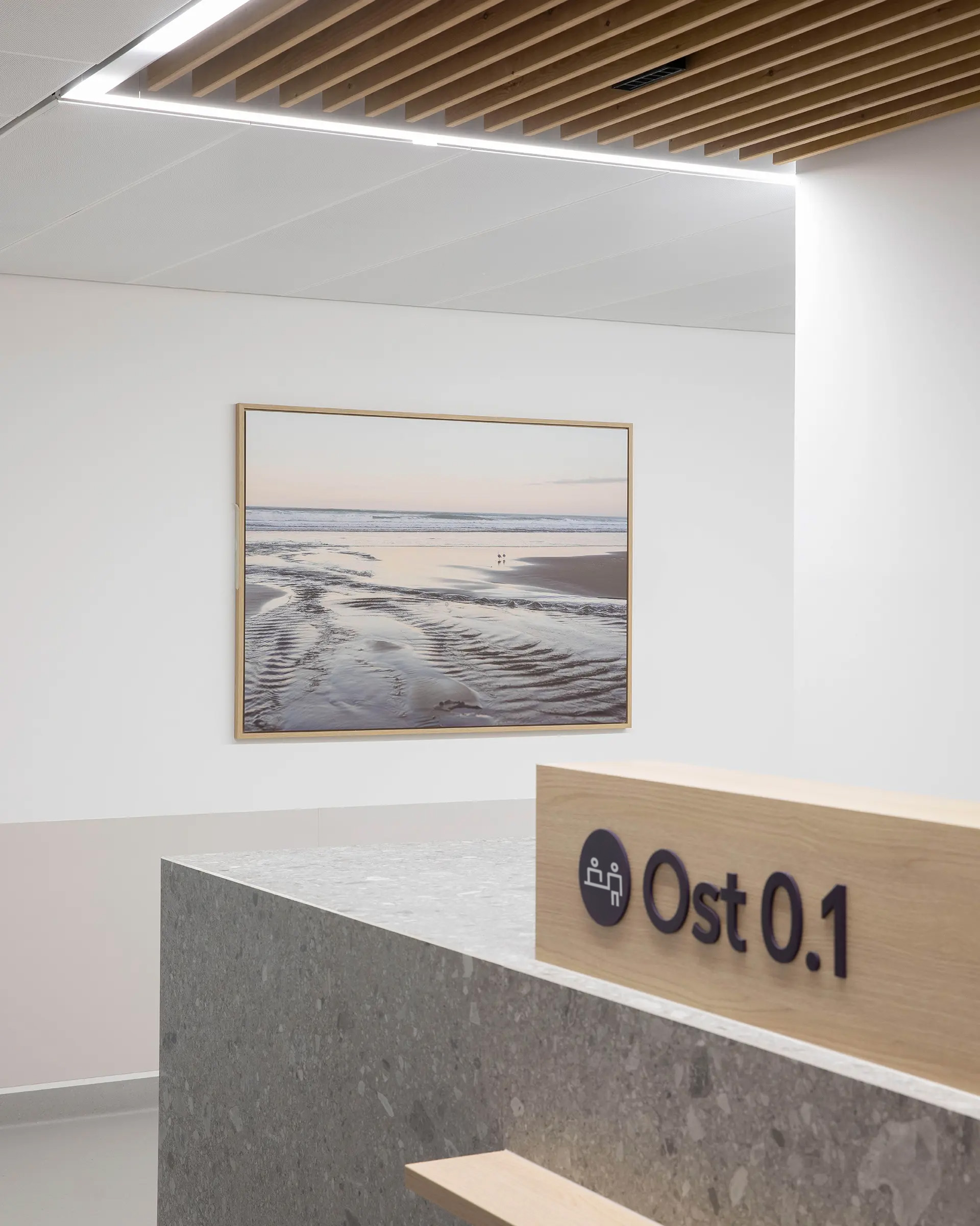
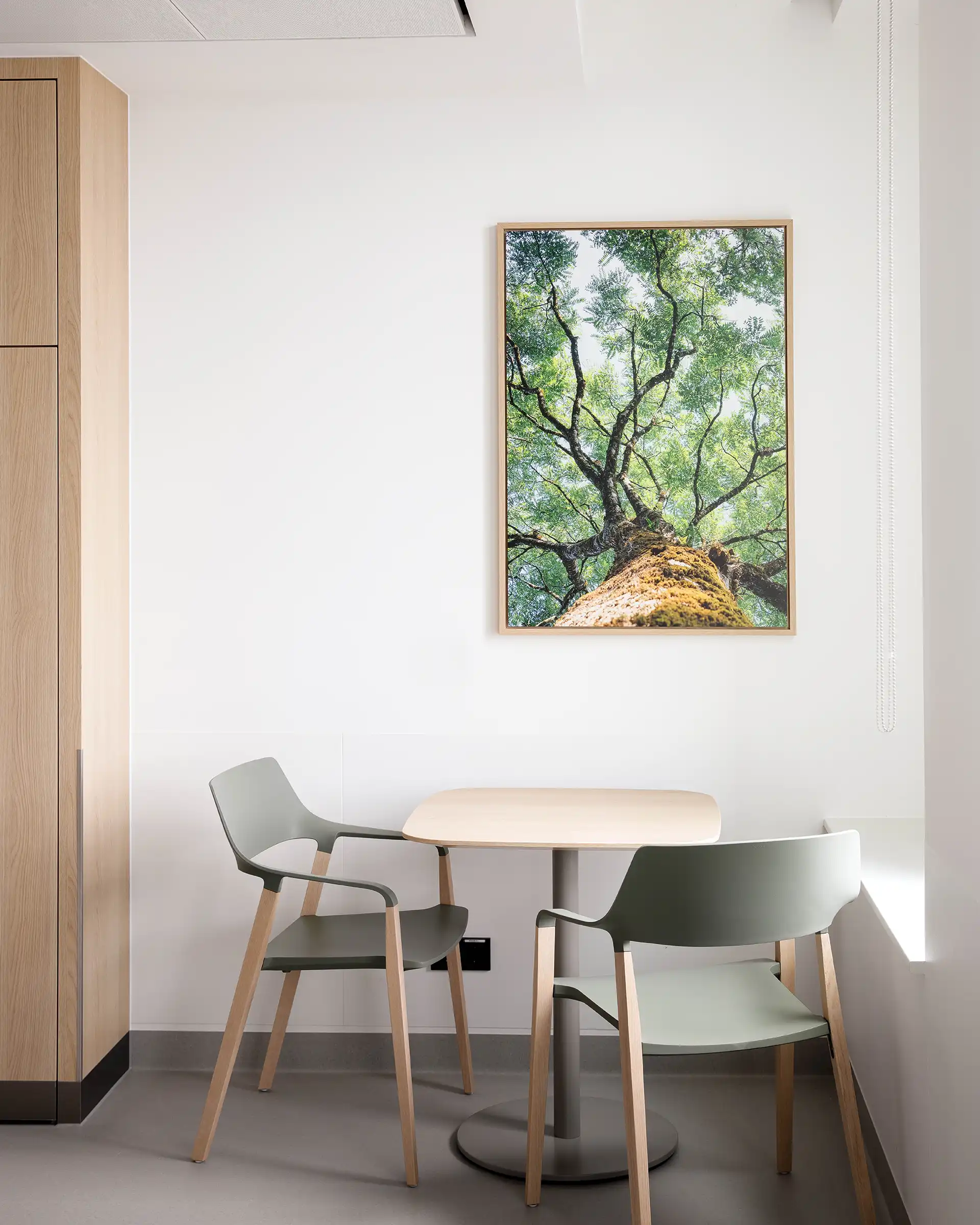
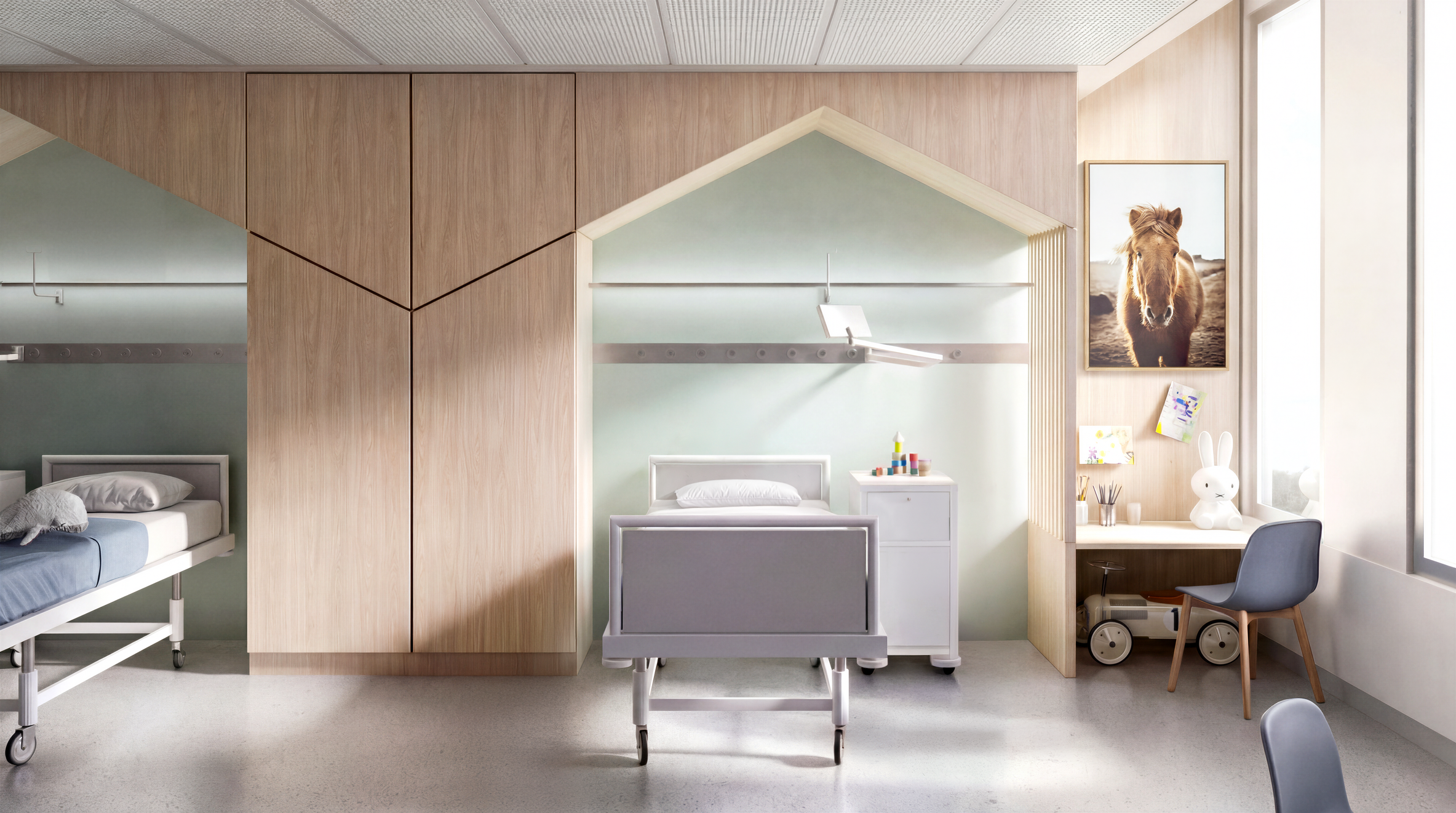
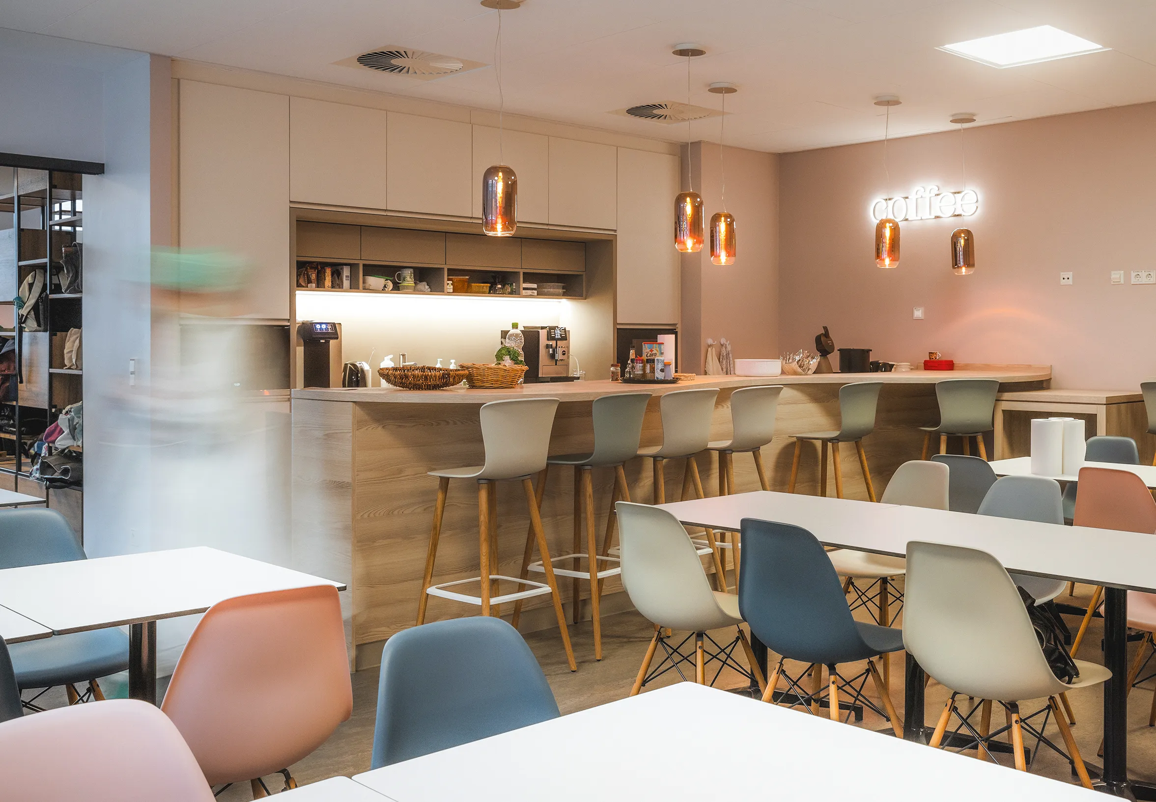
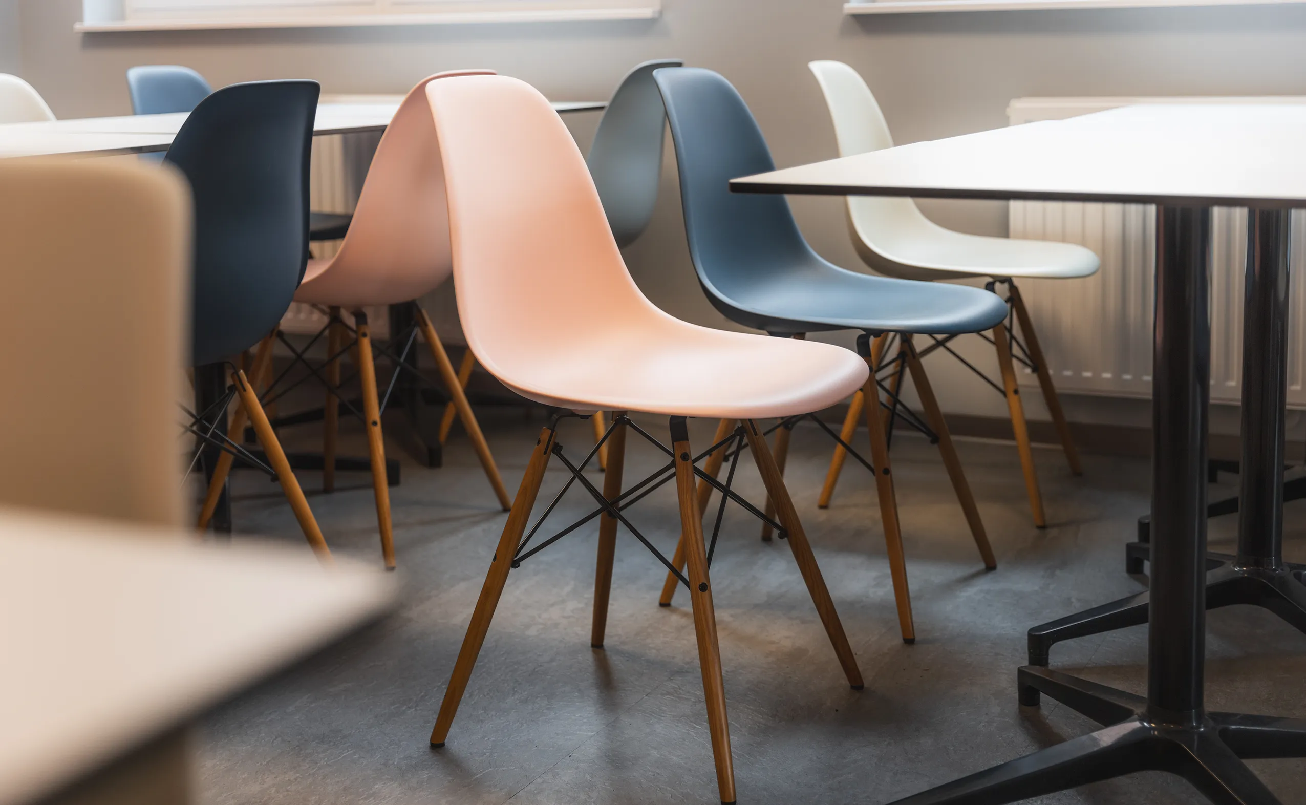
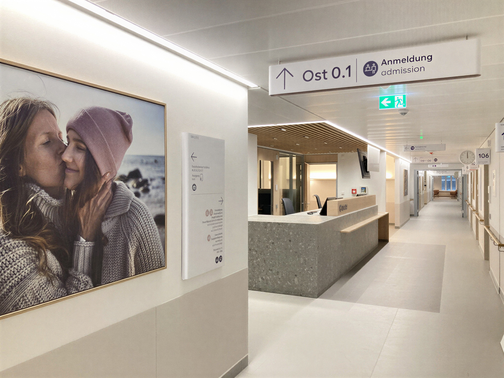
The new building needed a guidance system that works for everyone. For the 78-year-old patient with visual impairment. For the non-German-speaking family from another cultural background. For the nurse moving at speed. And for the five-year-old who needs to understand which way to go.
.png)
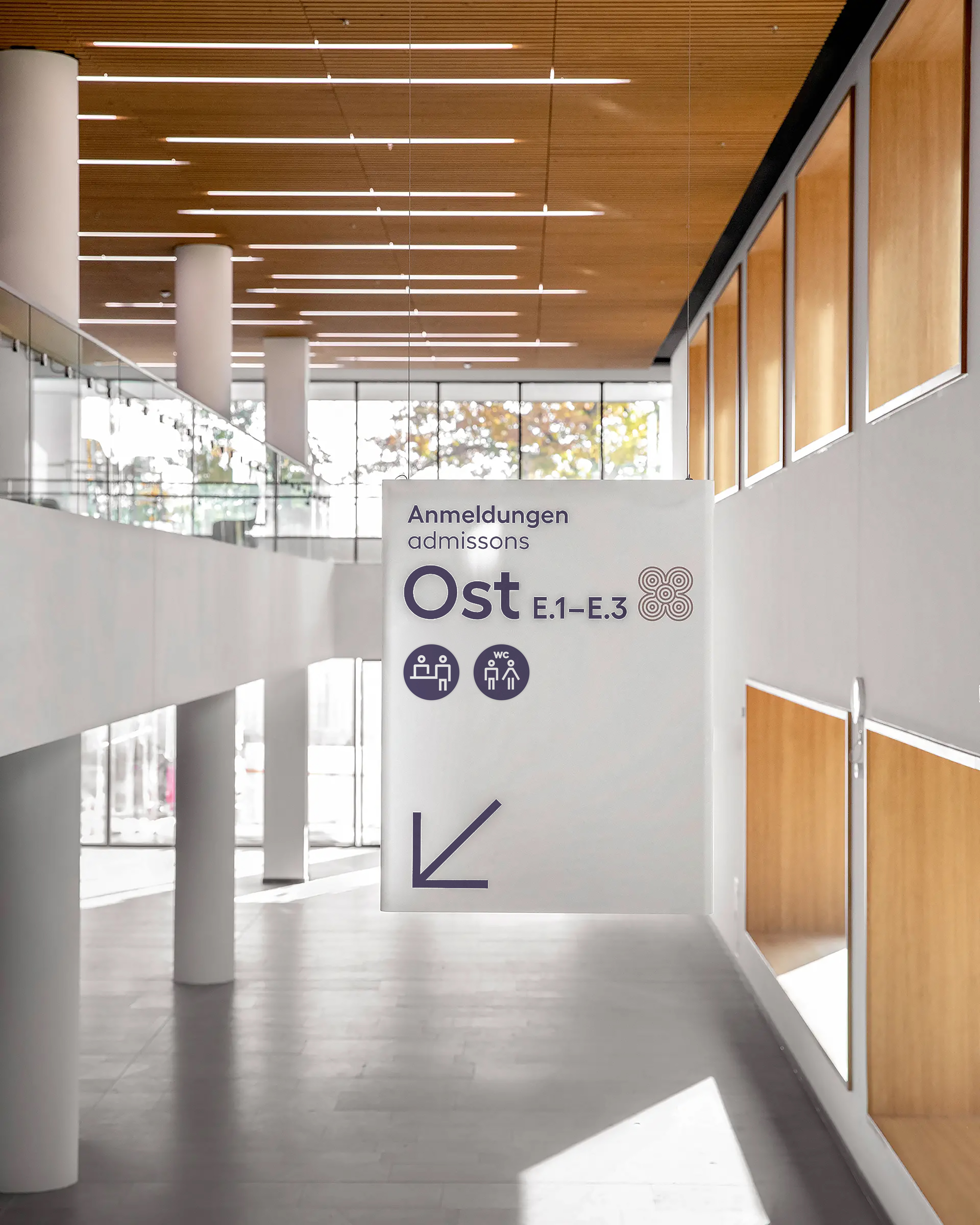
The skbs pictogram system follows a simple principle: maximum clarity with minimal form. I supported a colleague in developing an extensive icon library designed to work consistently across print, digital applications and signage.
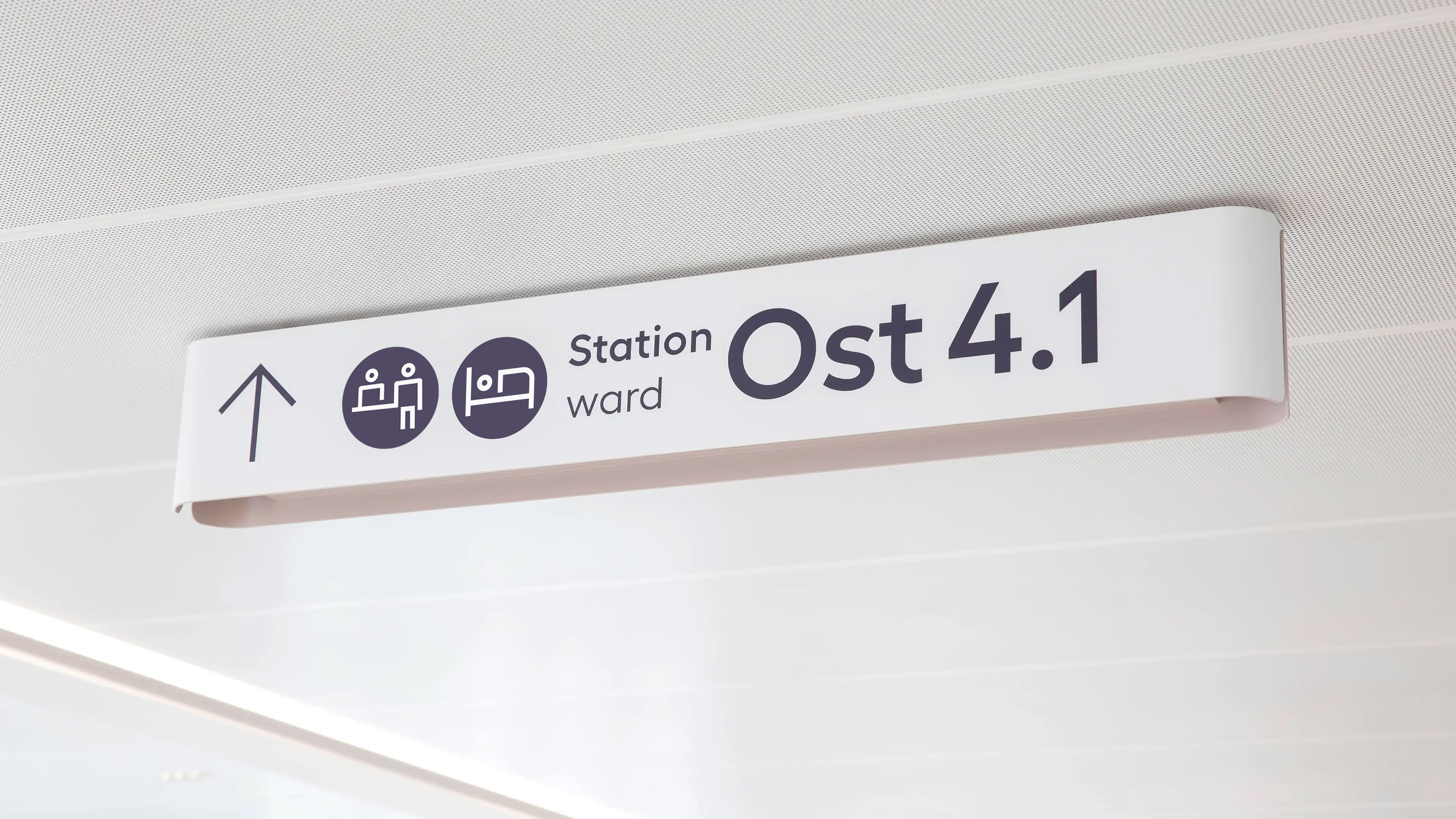
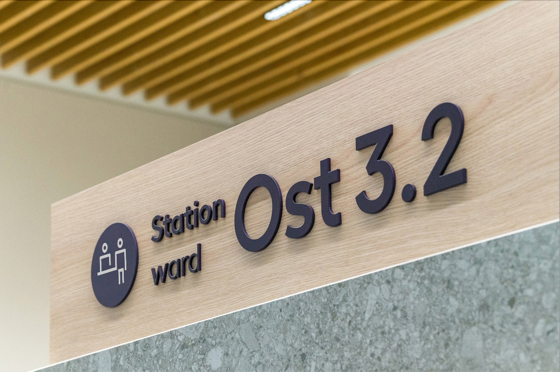
Consistent stroke weight. Consistent spacing between form and frame. This consistency has a practical purpose: when the hospital opens a new department in five years, a new pictogram can be developed to fit seamlessly into the existing system.
The numbers tell more than a good story: 195 hires in 2021, 246 in 2022, 379 in 2023, 582 in 2024. By the first quarter of 2025, skbs had already matched what once took a full year.
A rebrand rarely gets to point at numbers this clear. This one can.