
Städtisches Klinikum Braunschweig gGmbH
cyclos design GmbH
Art Direction · Brand & Digital Experience
Red Dot Award
iF Design Award
Annual Multimedia Award

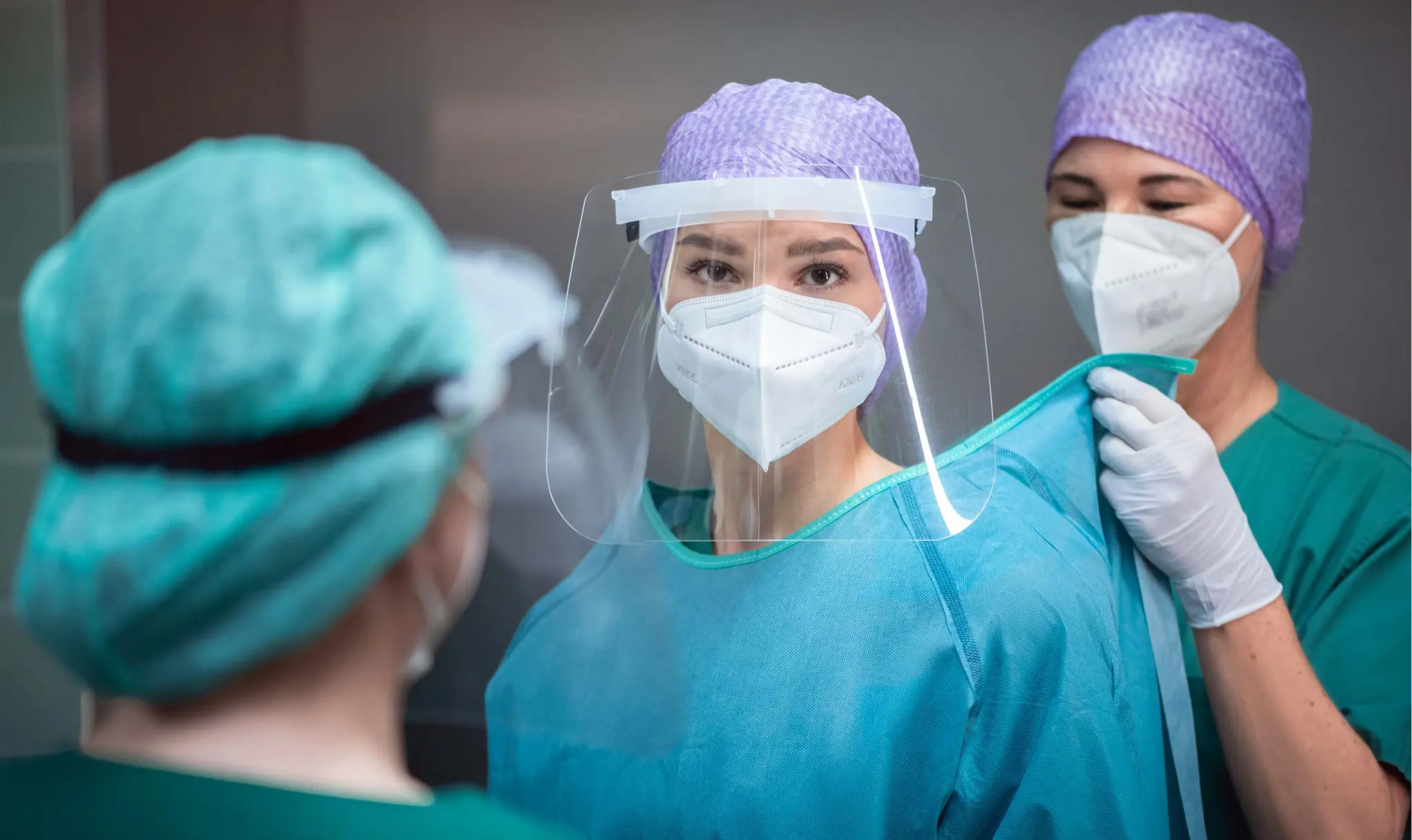
With over 4,000 employees and 22 specialist clinics, Städtisches Klinikum Braunschweig is one of Germany’s largest hospitals.
A hospital at this scale needed a clear and flexible brand system that supports recruitment, improves orientation and builds trust.
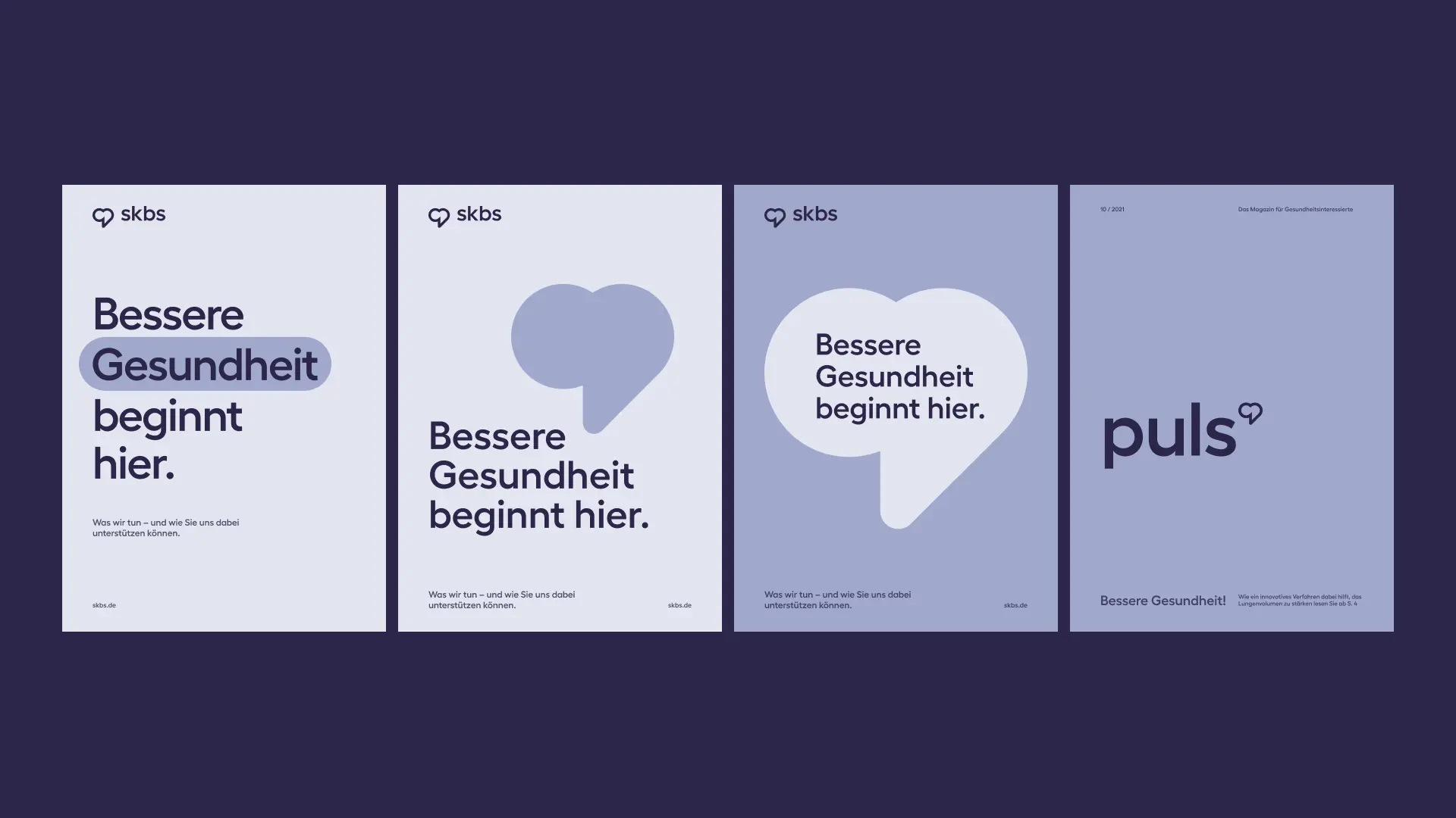
Its new brand identity transformed skbs from a primarily clinical institution into a more human and connected employer and healthcare brand. A comprehensive strategy process defined “Sense of Belonging” as its employer purpose, shaping the new positioning and brand promise: “Better health starts here.”
Two logo concepts were developed, including one by me. The client selected "the heart" created by my colleague Thorsten Schechowiz. My role then focused on translating the chosen logo into a scalable visual system across key touchpoints.
Within the multidisciplinary team, I was responsible for:
- Visual identity system
- Colour, illustration, icons and wayfinding systems
- Scalable layouts for print and digital (UX/UI)
- Campaign Concepts
A project of this scale needed to work consistently across all touchpoints and be easy for internal teams and multiple external agencies to use.
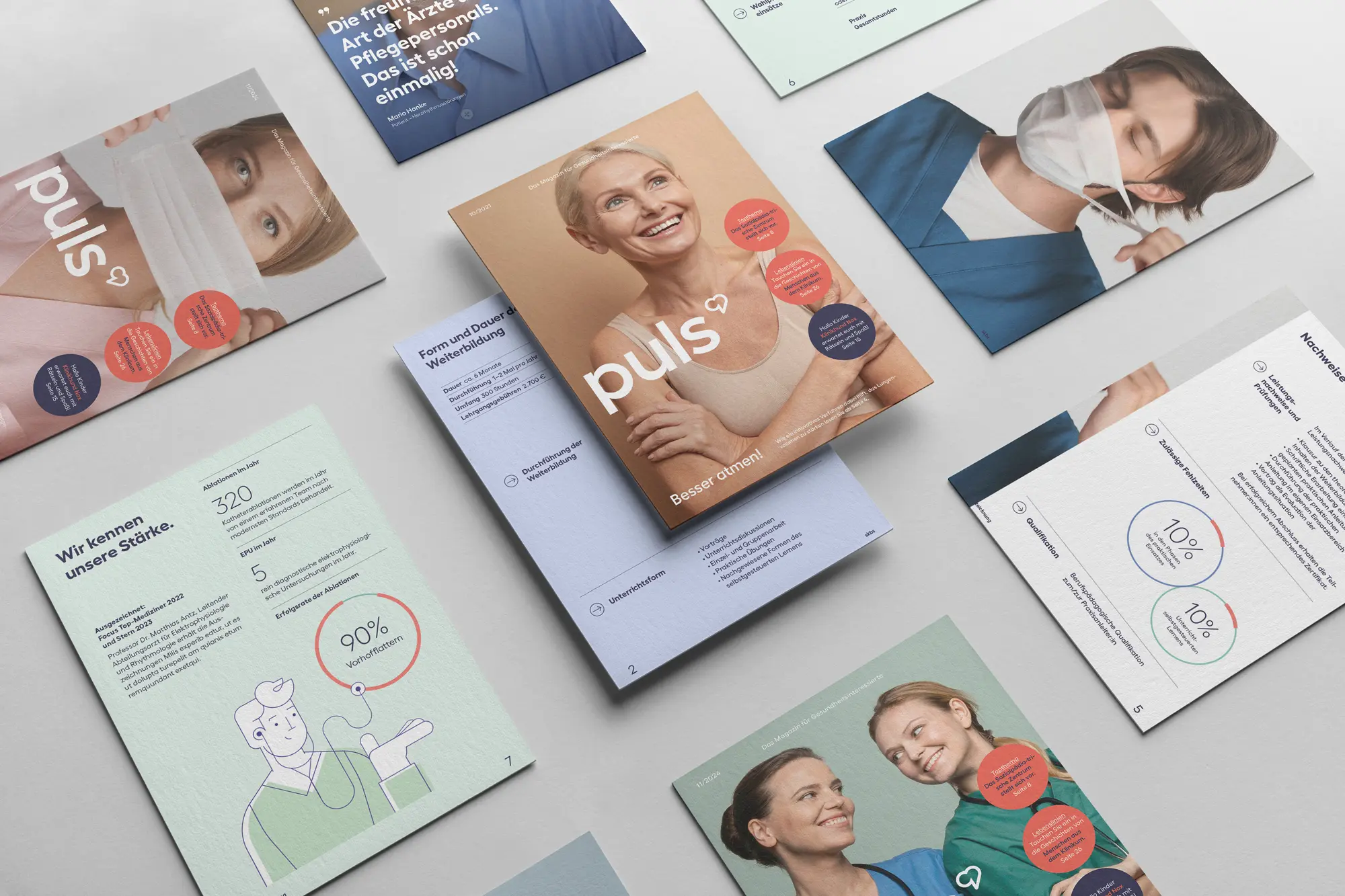
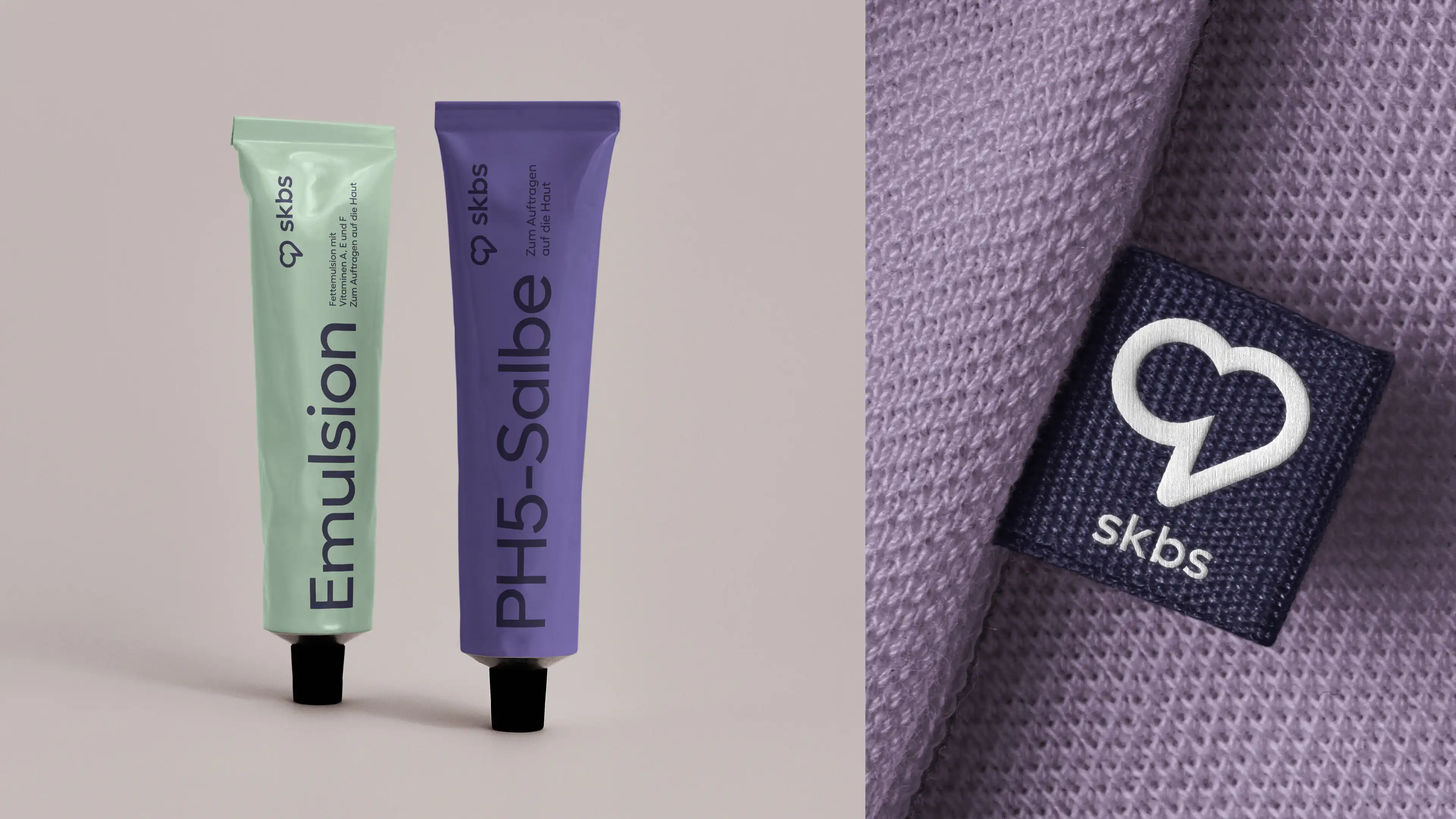
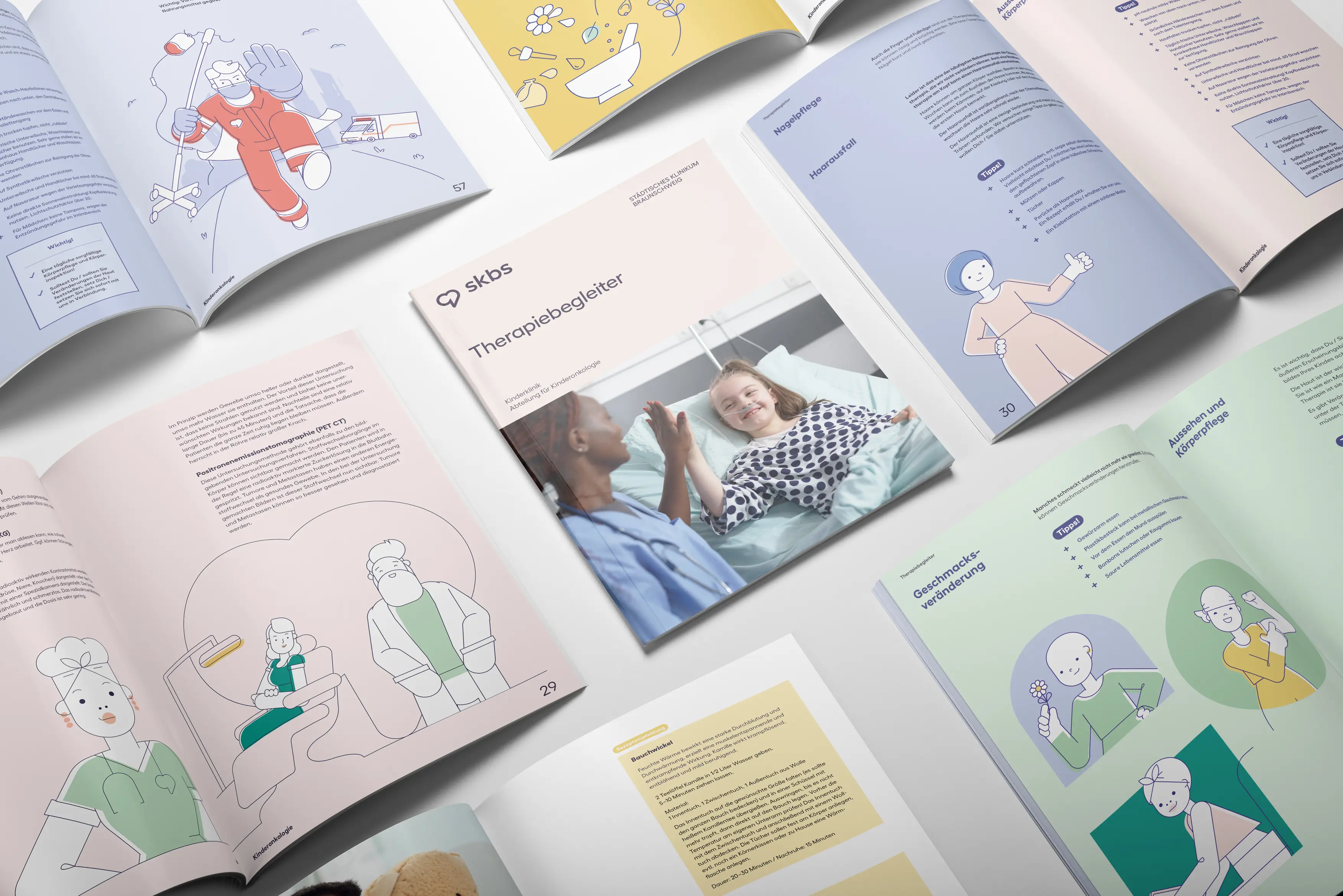
Light colors, simple typography, human-centred imagery and adaptable graphic elements create consistency across digital, print and physical touchpoints, while leaving enough flexibility for different departments, campaigns and audiences.
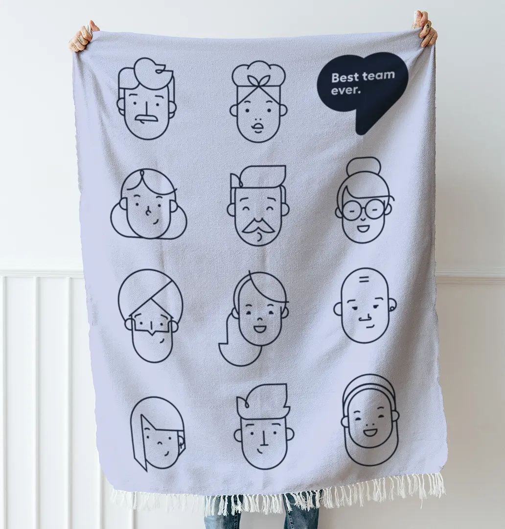
Rich diversity.
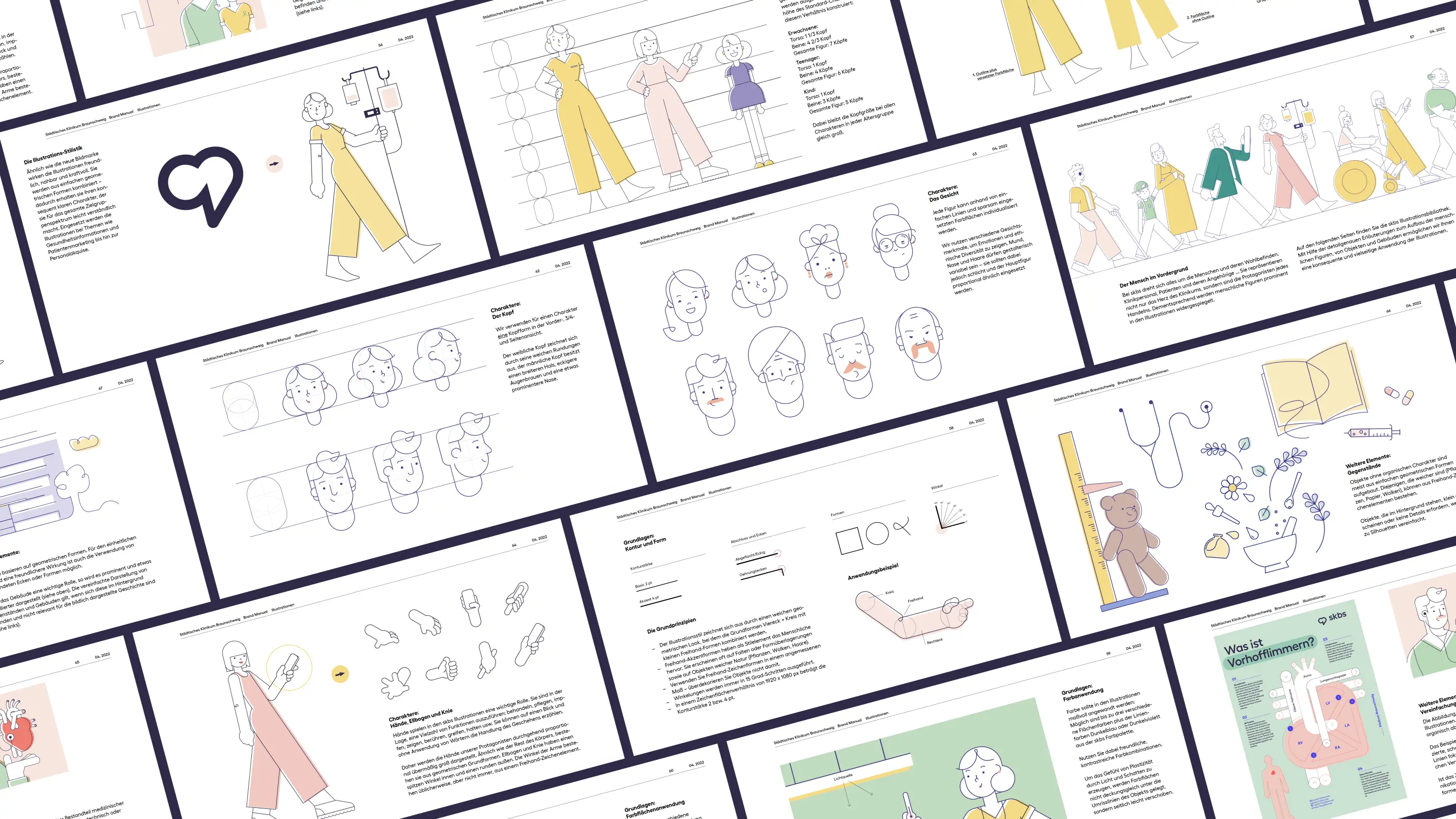
The illustration system reflects skbs’s diverse workforce through varied facial features, hairstyles, ages and individual characteristics. It makes medical content approachable, bridges language barriers and builds emotional connection while representing people across the clinical environment.
An entend illustration library of predefined, interchangeable elements lets different agencies create characters and scenes easily in one consistent style. Full-colour and two-colour versions meet the practical needs of everyday hospital communication.
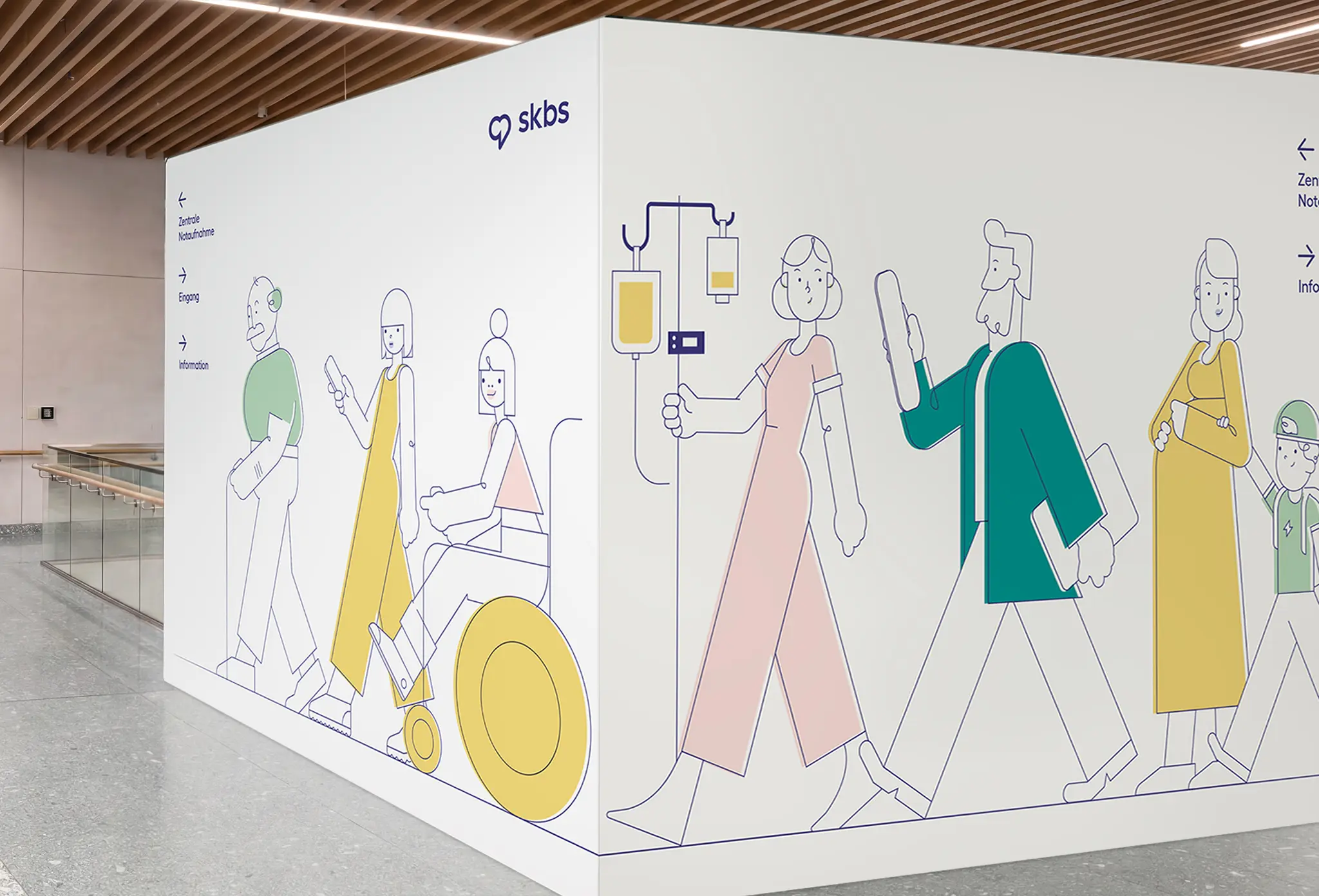
The new building needed a guidance system that works for everyone. For the 78-year-old patient with visual impairment. For the non-German-speaking family from another cultural background. For the nurse moving at speed. And for the five-year-old who needs to understand which way to go.
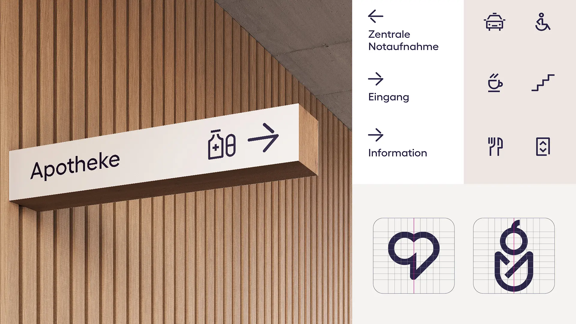

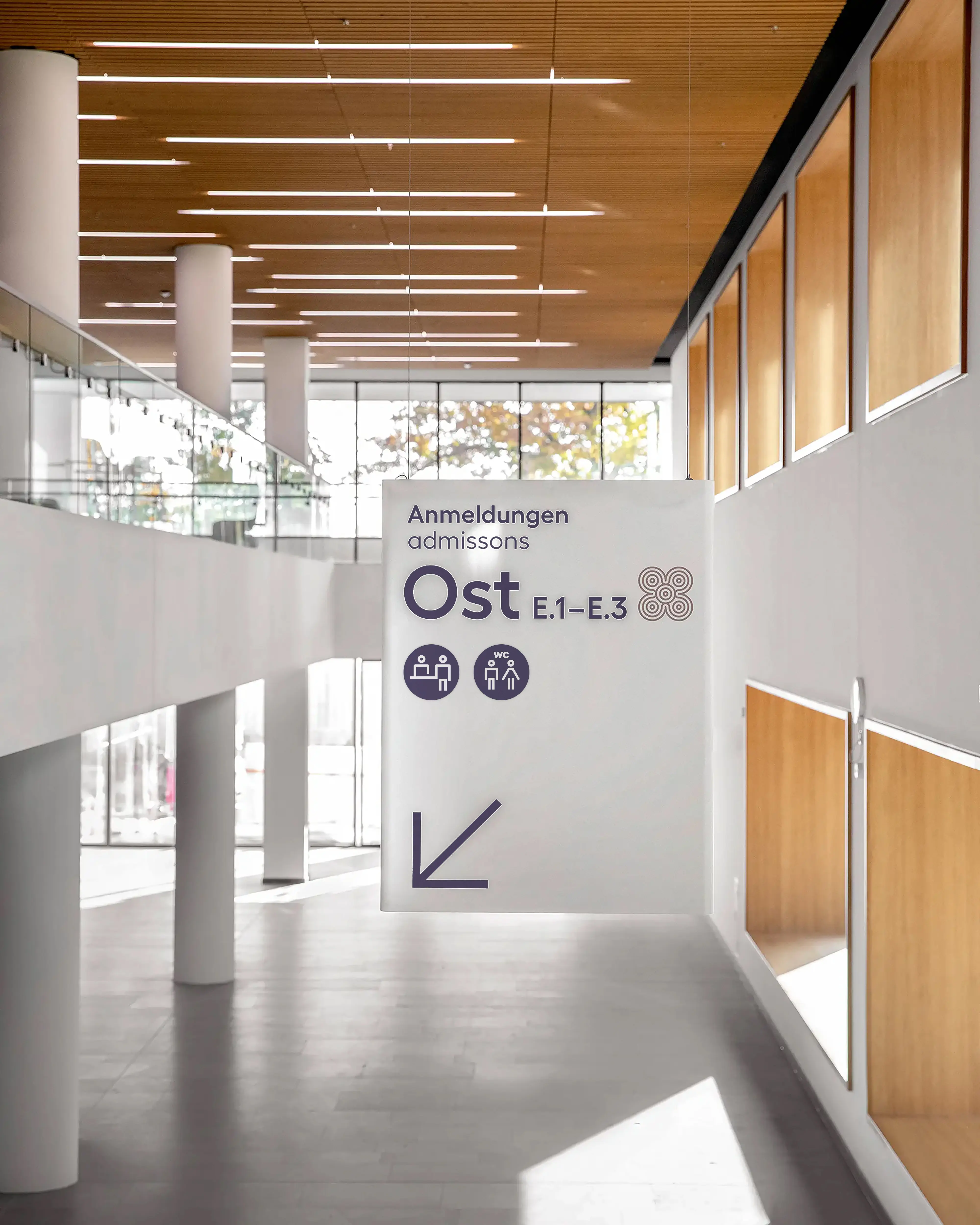
The skbs icon system combines maximum clarity with minimal form. I supported a colleague in developing an extensive library for print, digital applications and signage.
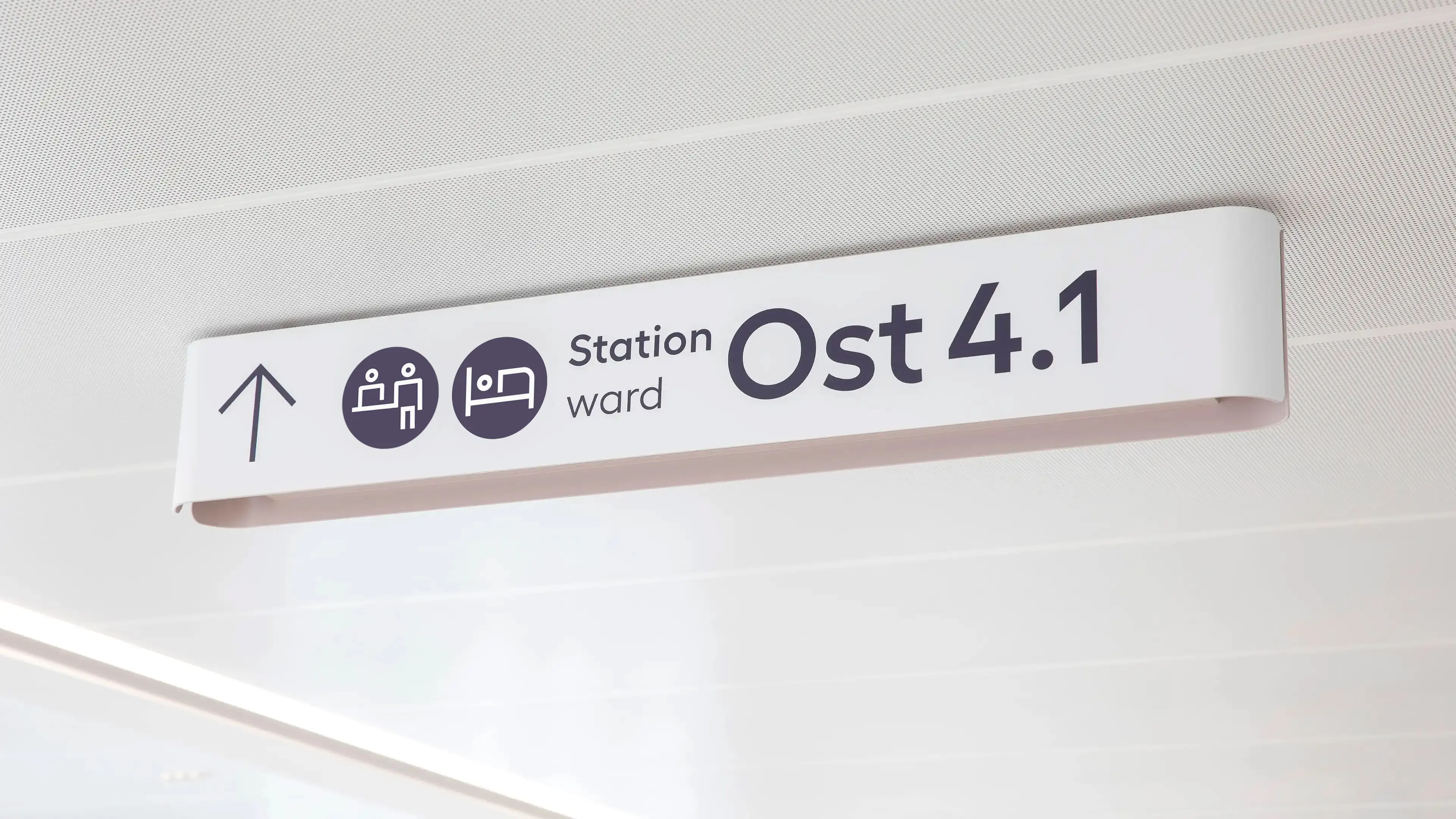
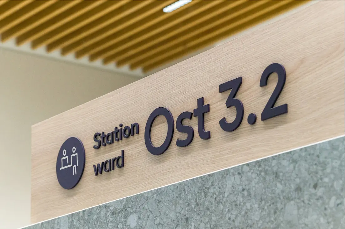
Consistent stroke weights and spacing between each symbol and its frame make the system easy to extend, so future departments can add pictograms that fit seamlessly.
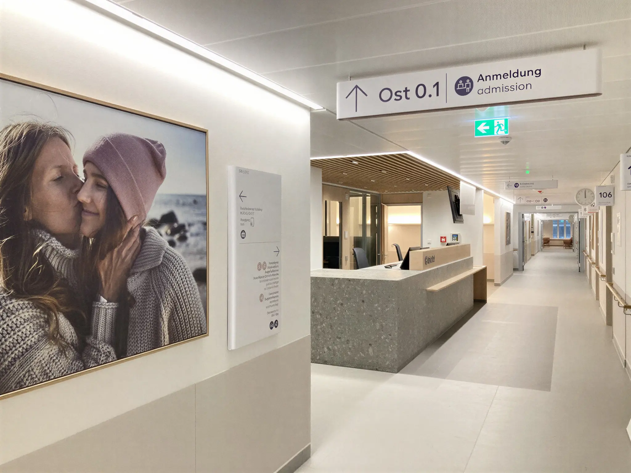
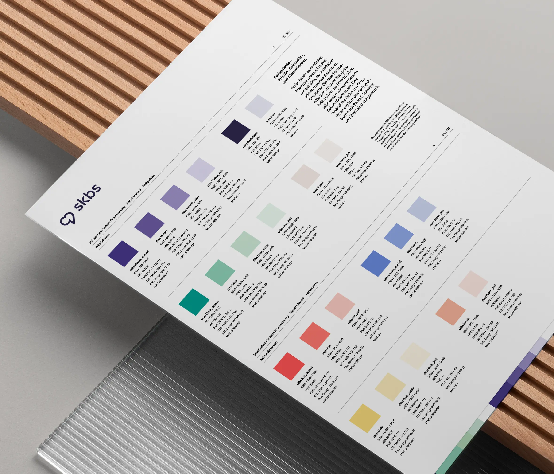
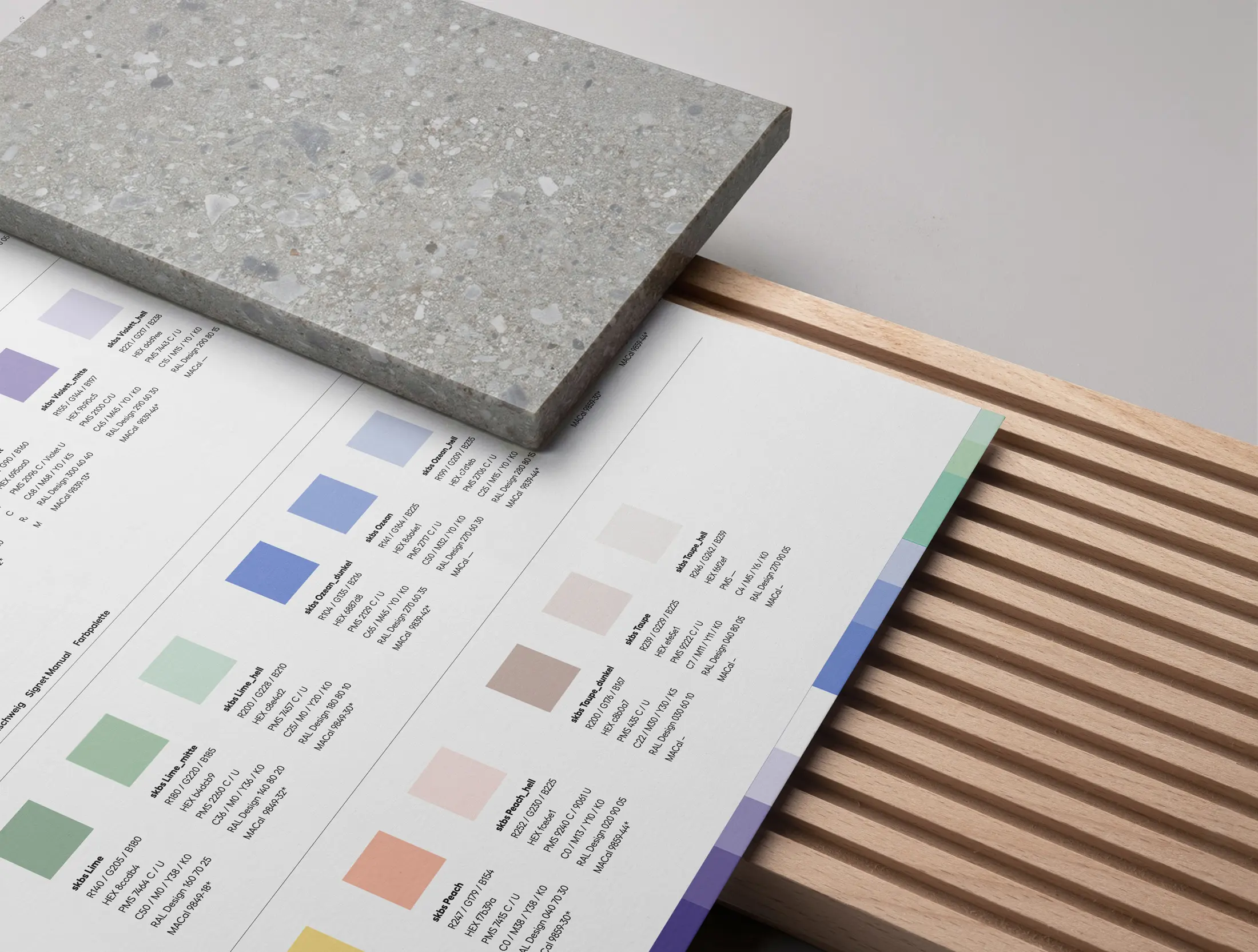
Choosing colours for a hospital as large as skbs meant balancing brand consistency across print and digital as well as interiors while keeping the needs of people recovering at the heart of every decision.
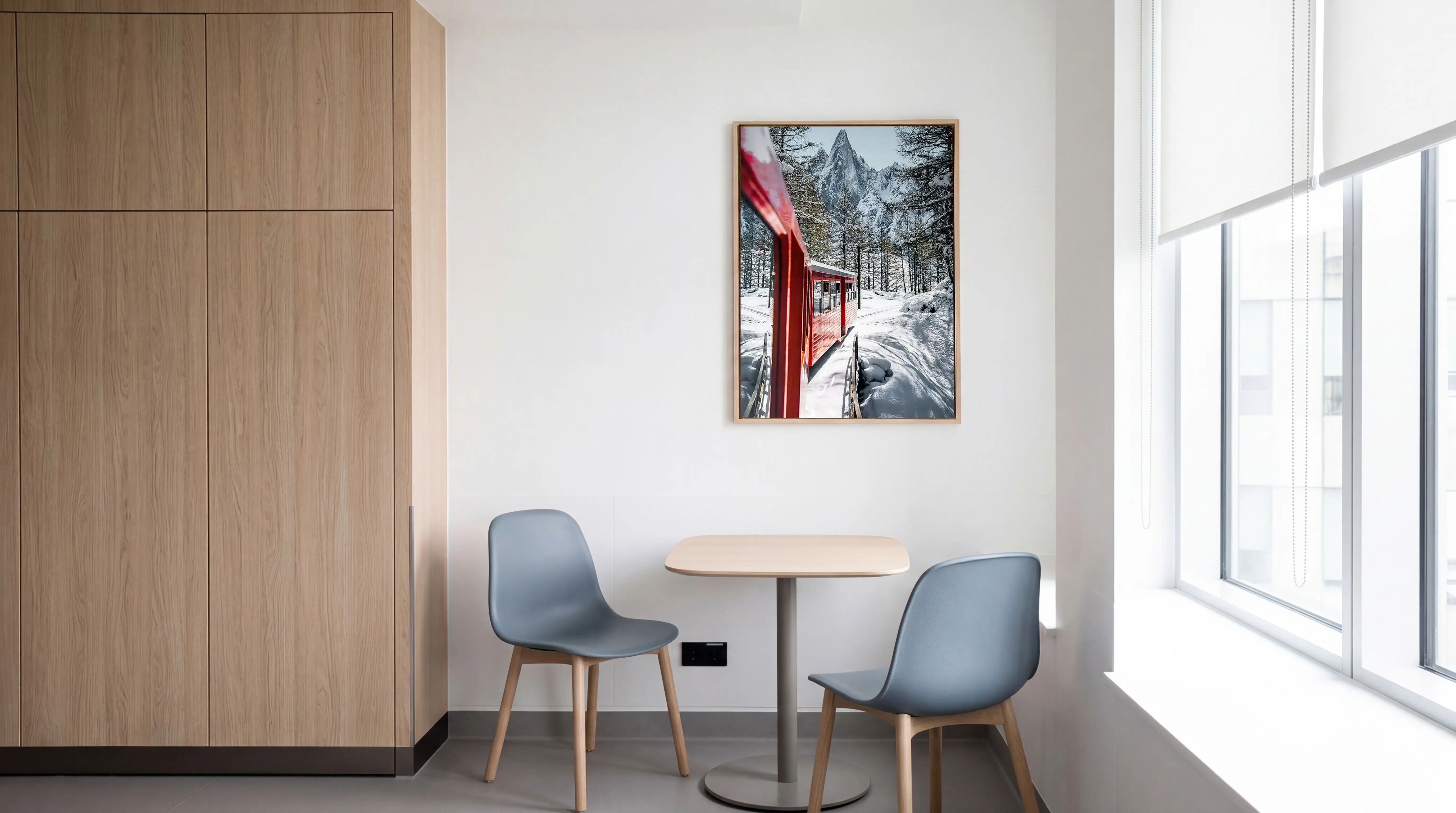
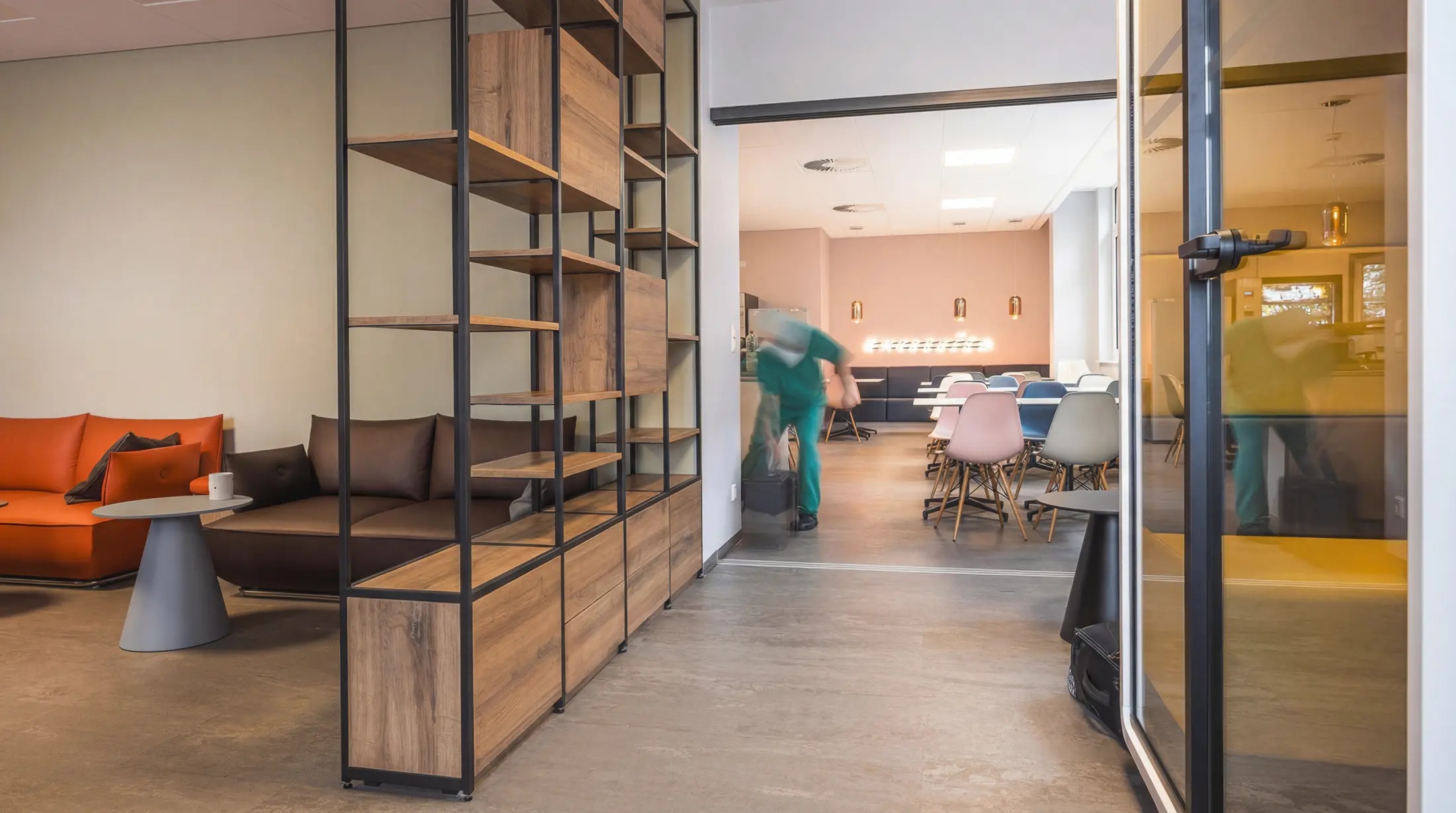
My research shaped the palette around biophilic design, which brings connections to nature into built spaces to support comfort and wellbeing. Working closely with the interior architects, we advised on translating these principles into the hospital environment.
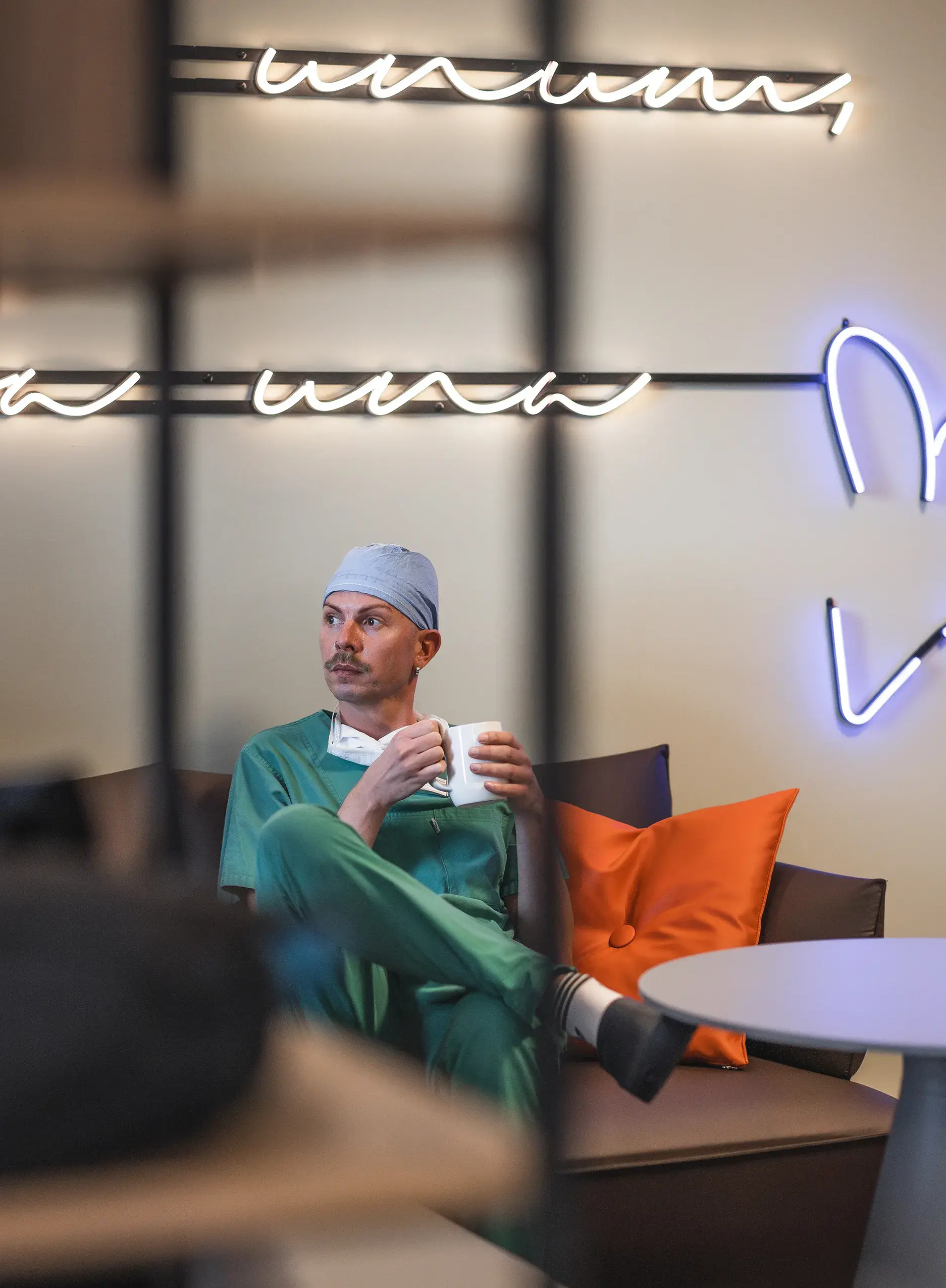
Light pastels and warm wood tones reduce visual noise and create a calm, welcoming atmosphere.
Natural materials, earthy neutrals and large-scale nature imagery, alongside textures inspired by bark and stone, make clinical spaces feel familiar and reassuring.
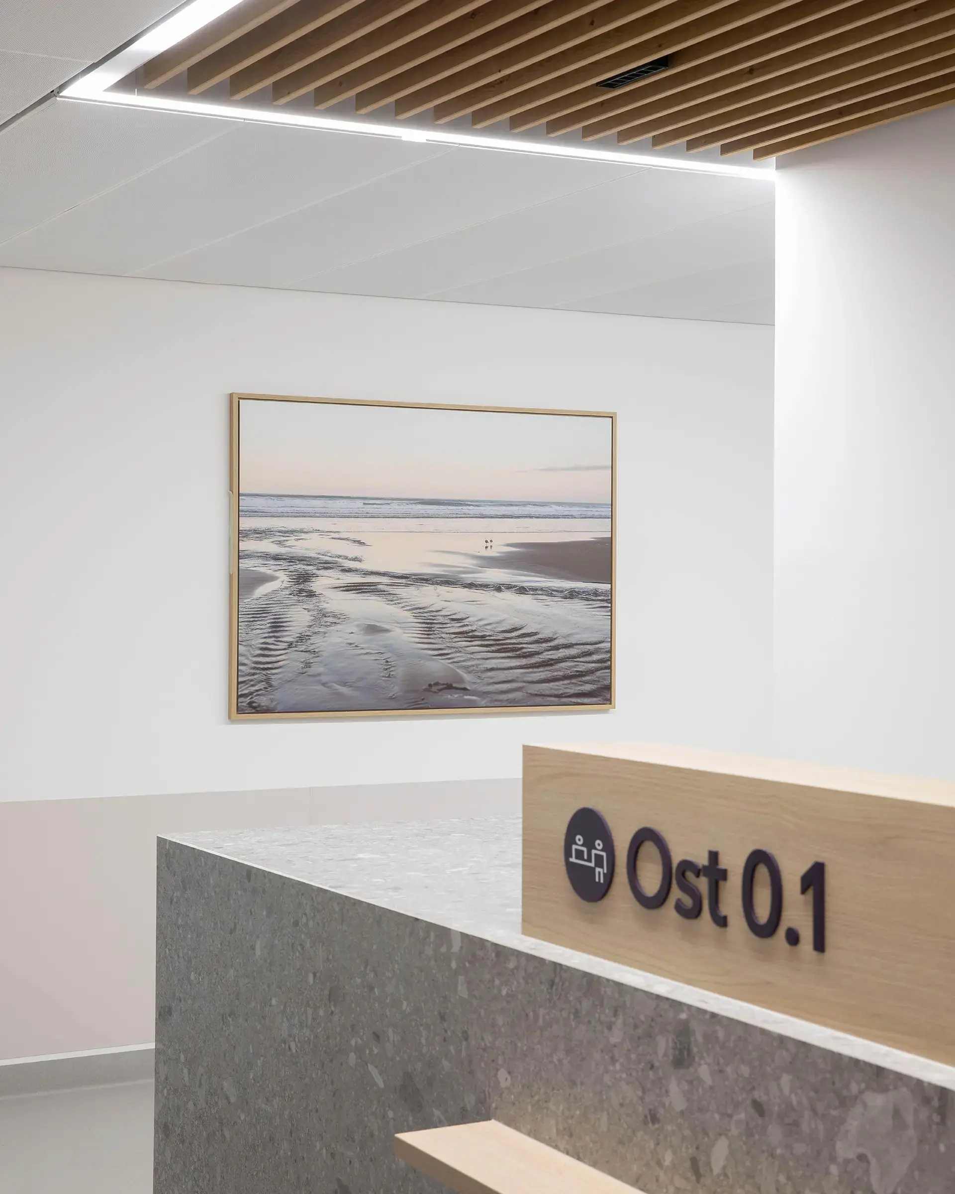
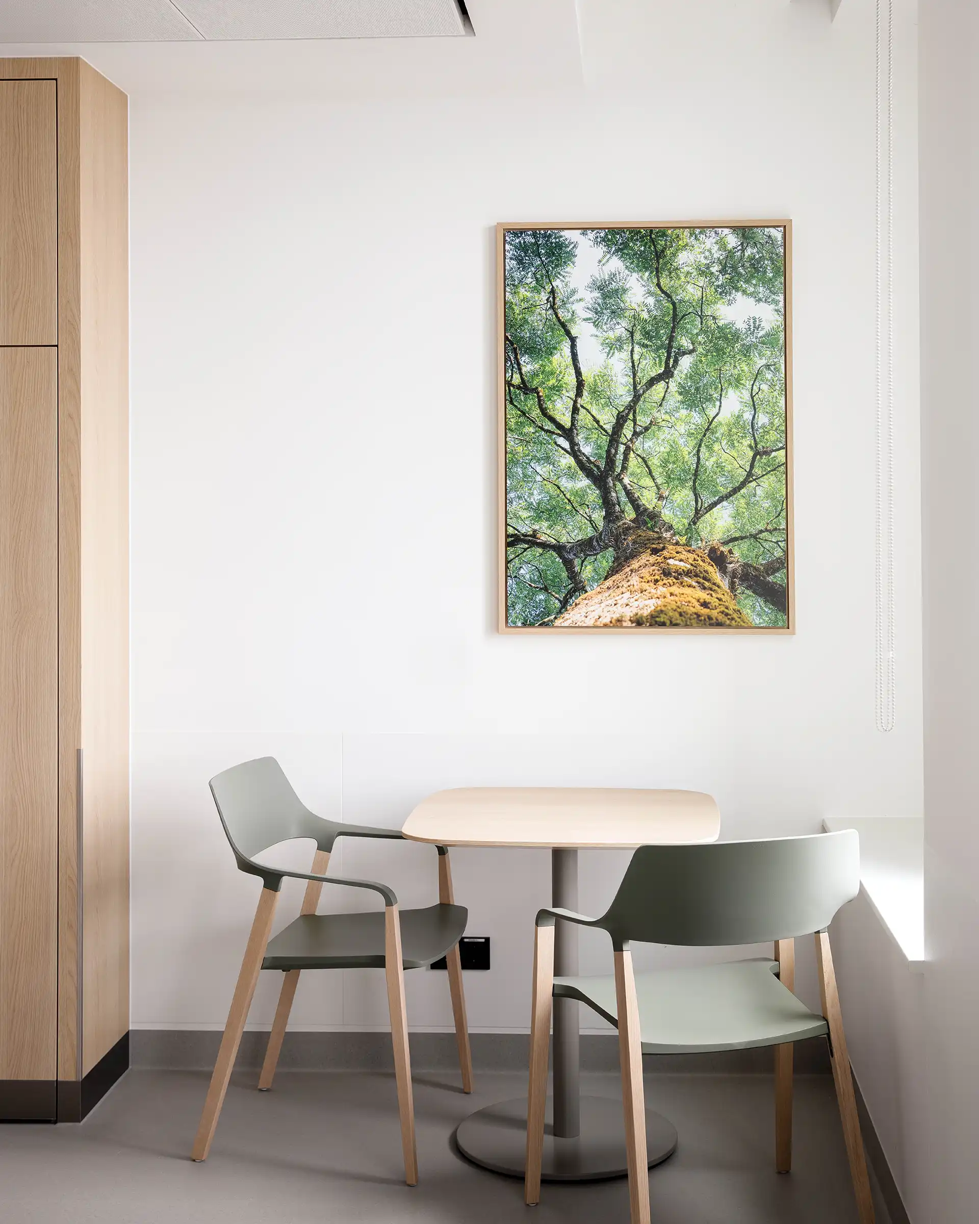
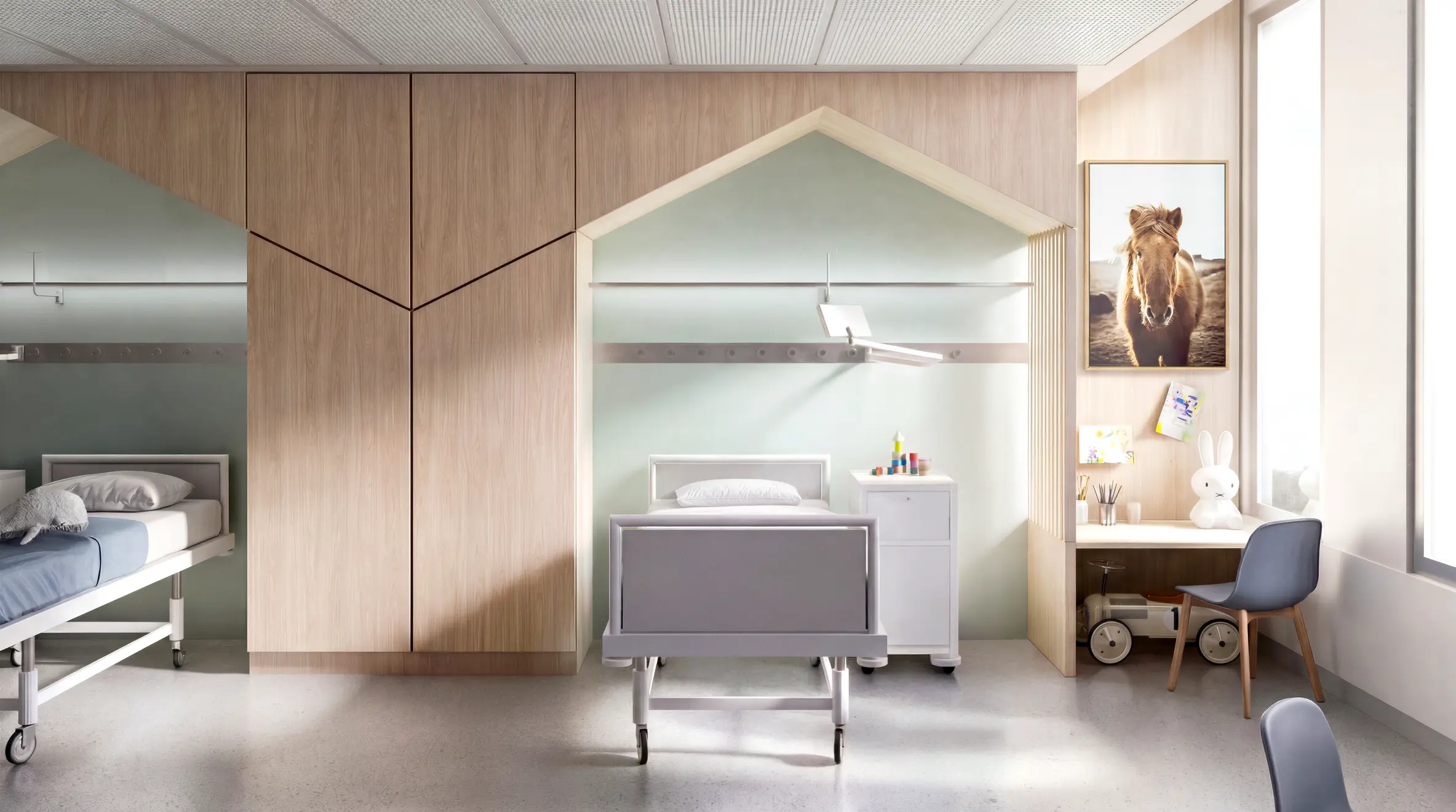
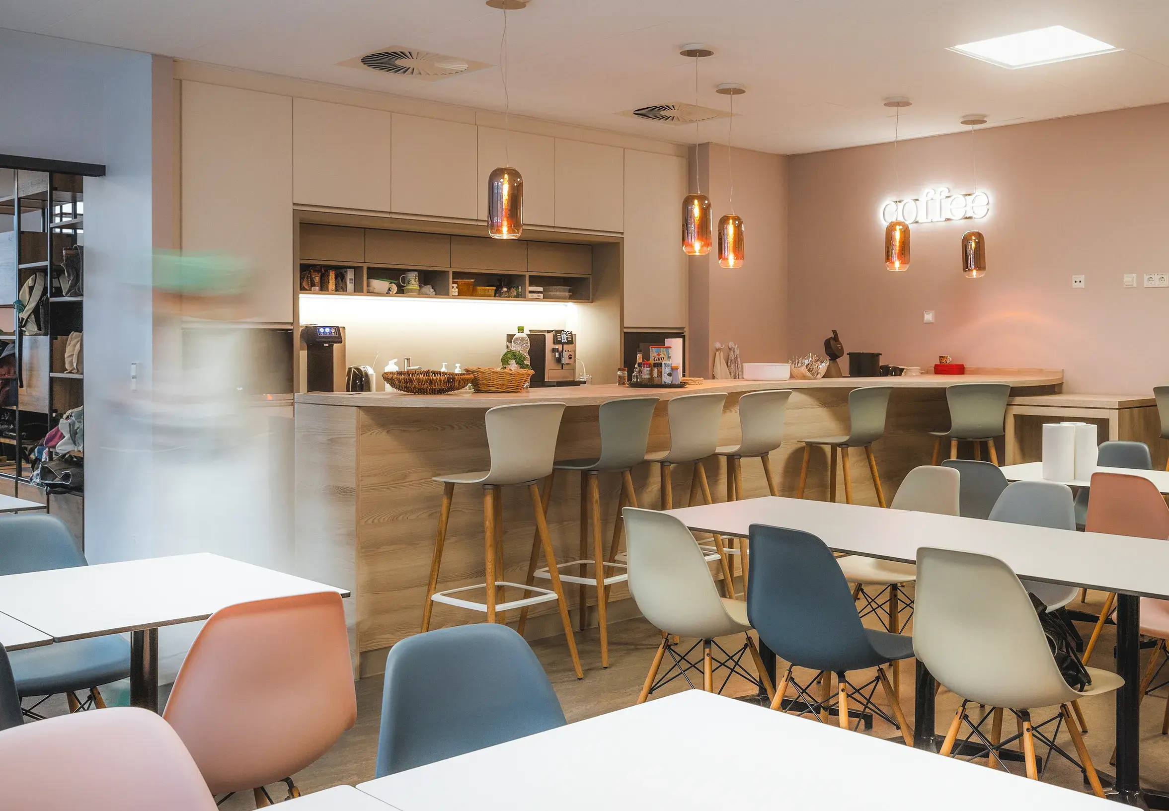
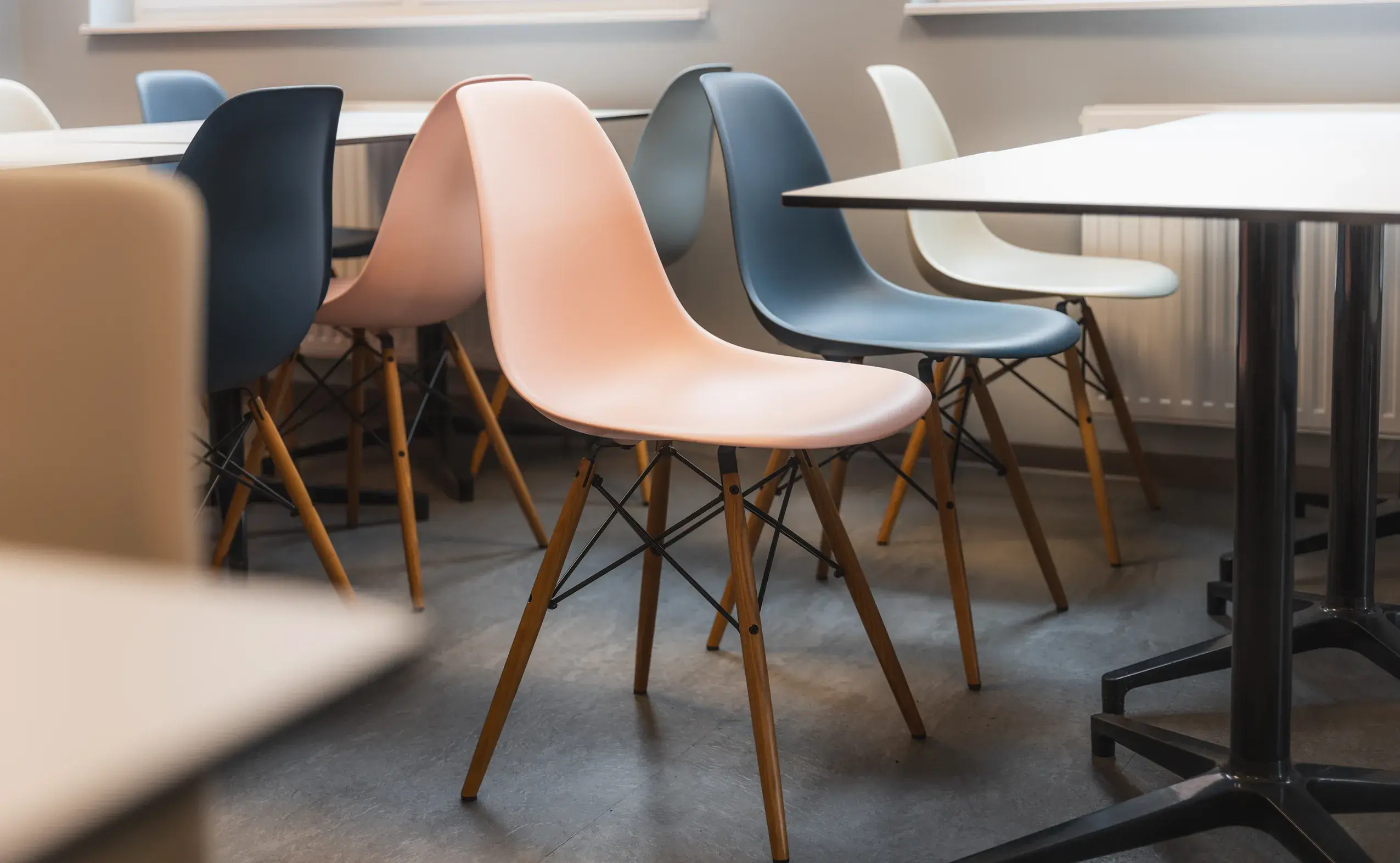
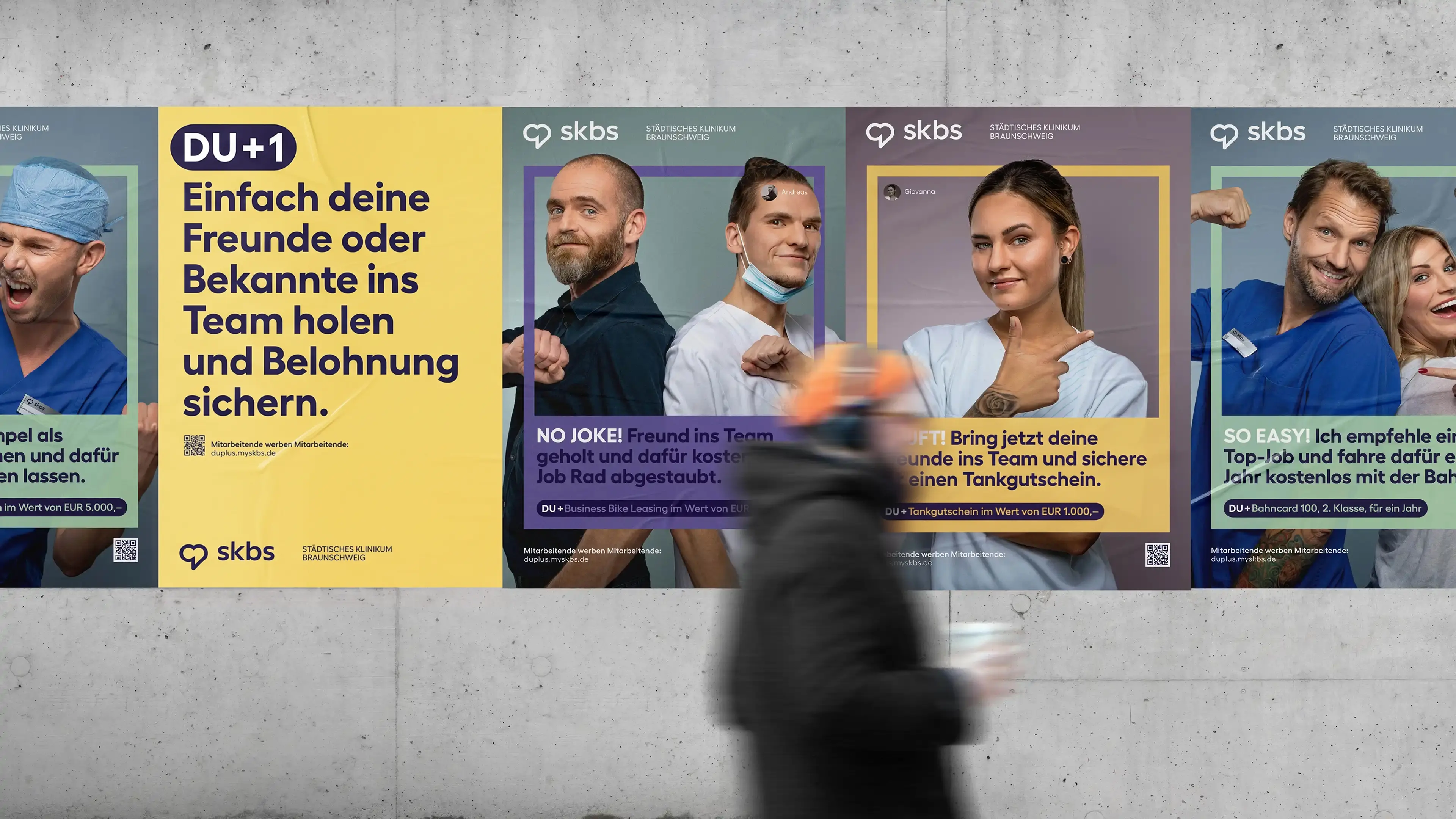
Germany’s healthcare system faces a severe talent shortage, with hospitals often relying on expensive headhunters to fill essential roles. But why look outside when the best recruiters are already inside the hospital?
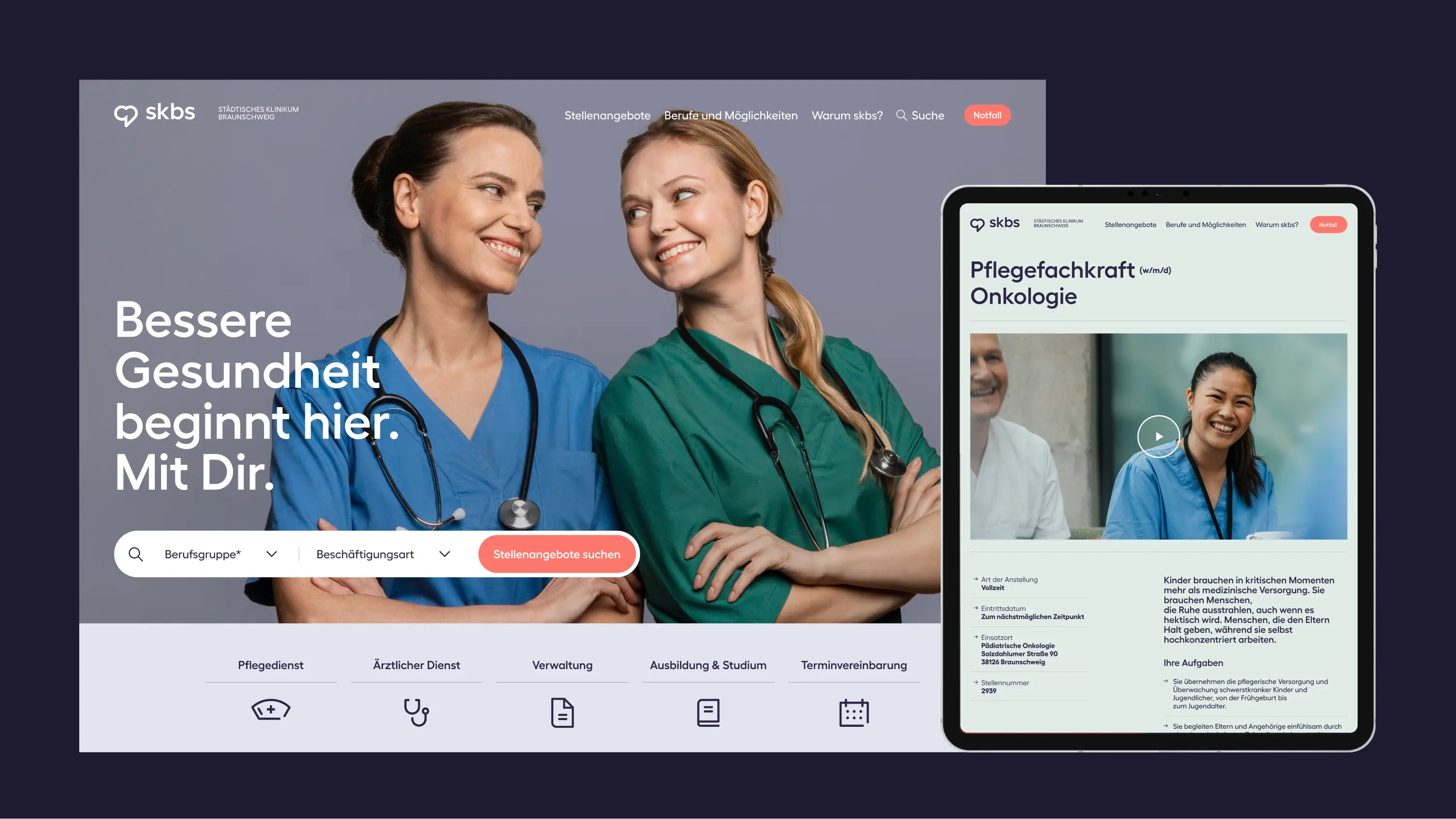
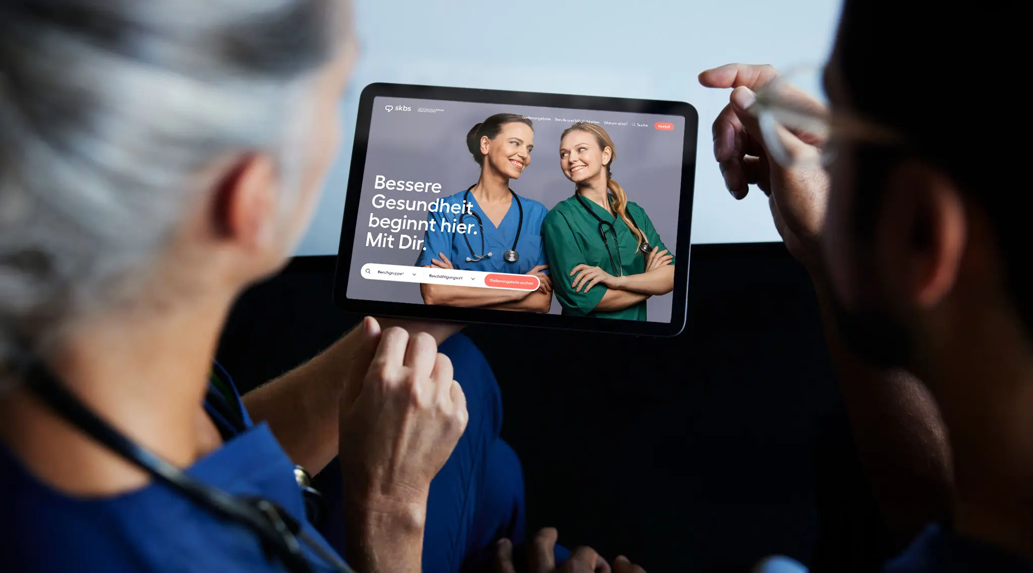
The campaign activated employees as trusted advocates, encouraging them to recommend people they genuinely wanted by their side. I helped develop the campaign concept and worked on the career portal and campaign website, supported by social media campaigns and branded goodies for employees.
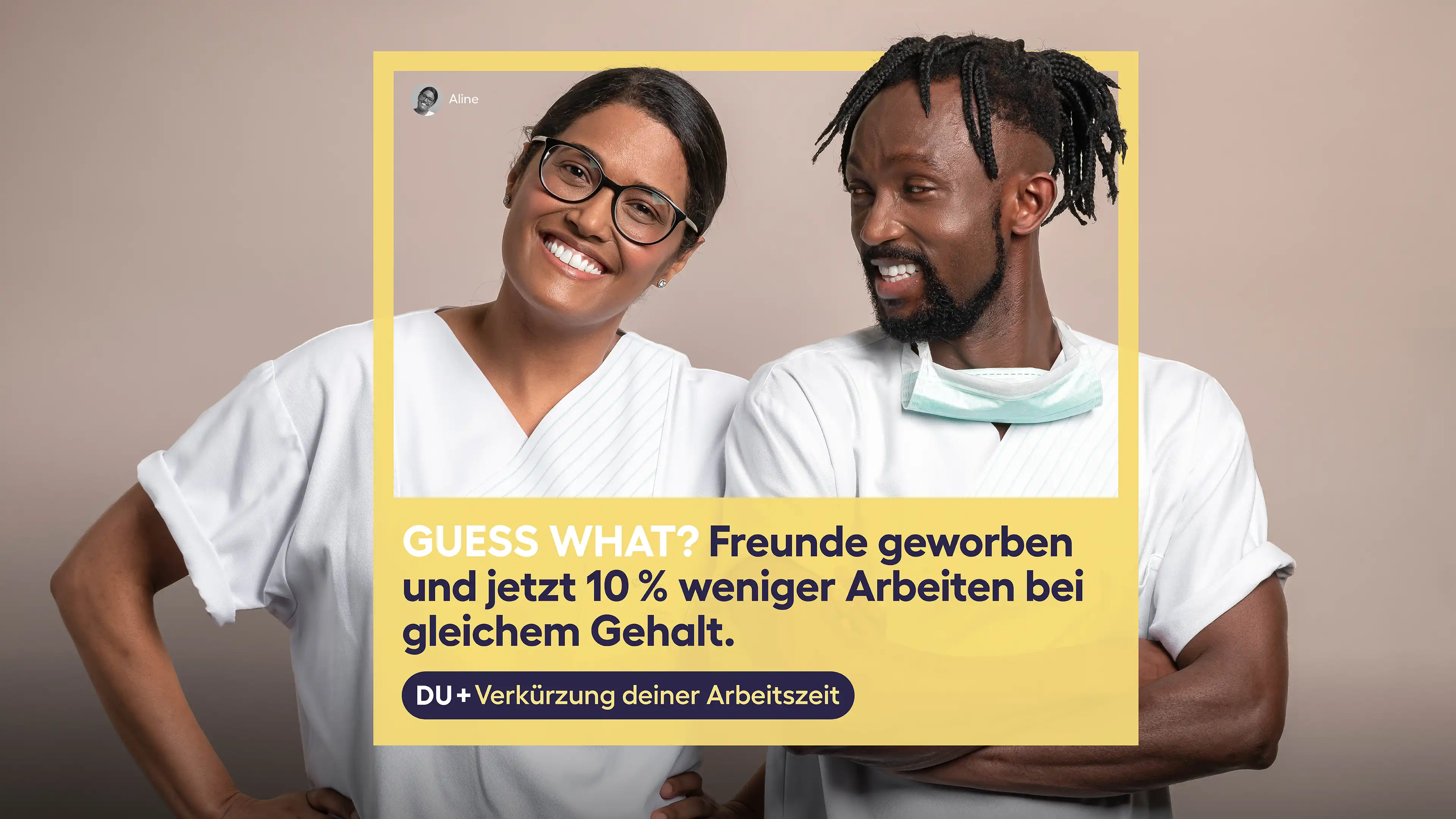
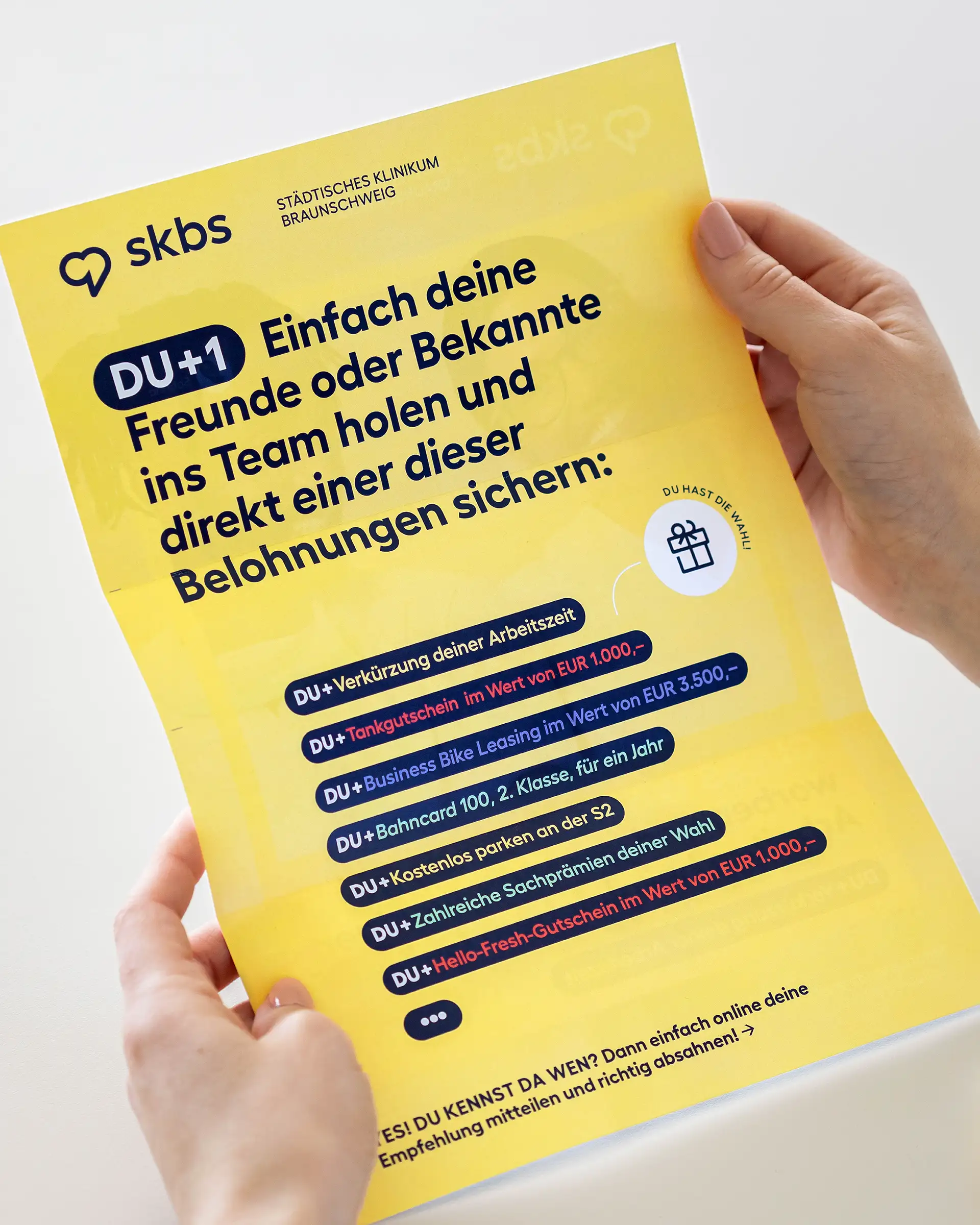
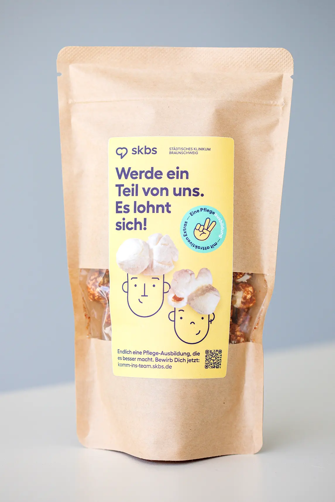
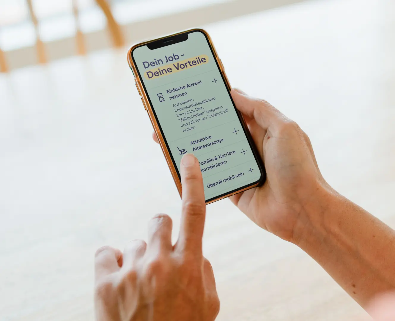
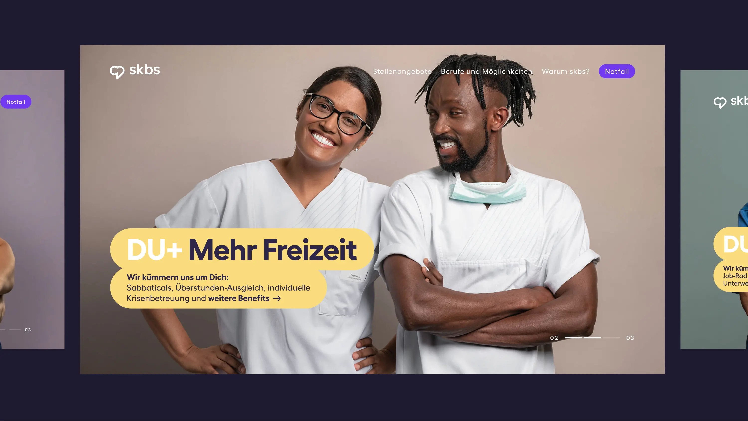
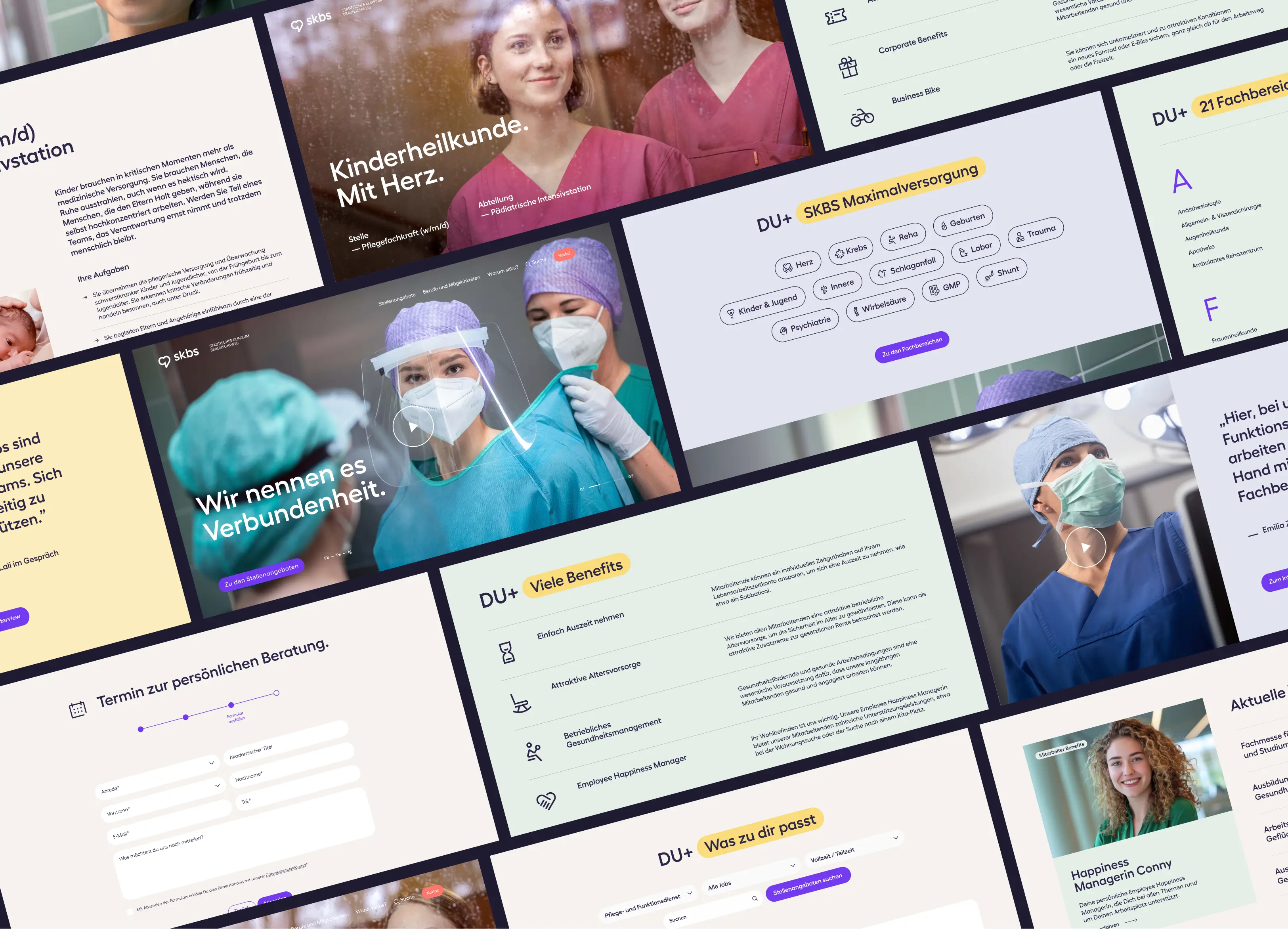

In 2020, skbs hired 193 new employees. By 2024, that number had climbed to 582. Almost triple.
That growth followed the launch of the new corporate identity in 2021 and 2022, and further campaigns built on it, DU+ among them.
Referrals and a stronger employer brand did what headhunters used to. A rebrand rarely gets to point at numbers this clear. This one can.